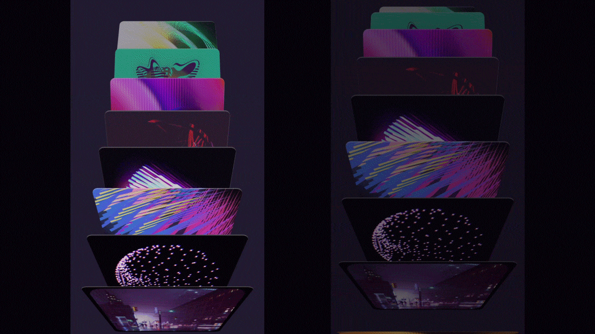
We’re really excited to introduce a new package called Flutter Custom Carousel, a widget for creating fully custom, animated scrollable lists. It manages all of the tricky logic surrounding scroll interactions and physics, and leaves the visual presentation of items up to you.
The idea came from discussions about building a carousel widget; we were looking at the wide diversity of carousel UIs, debating which one to create, and what parameters were needed to customize it. There were too many possibilities, each with a vast range of potential customizations, and it became obvious we either had to pick a single option and try to perfect it, or take a more radical approach that empowered developers to do “anything”.
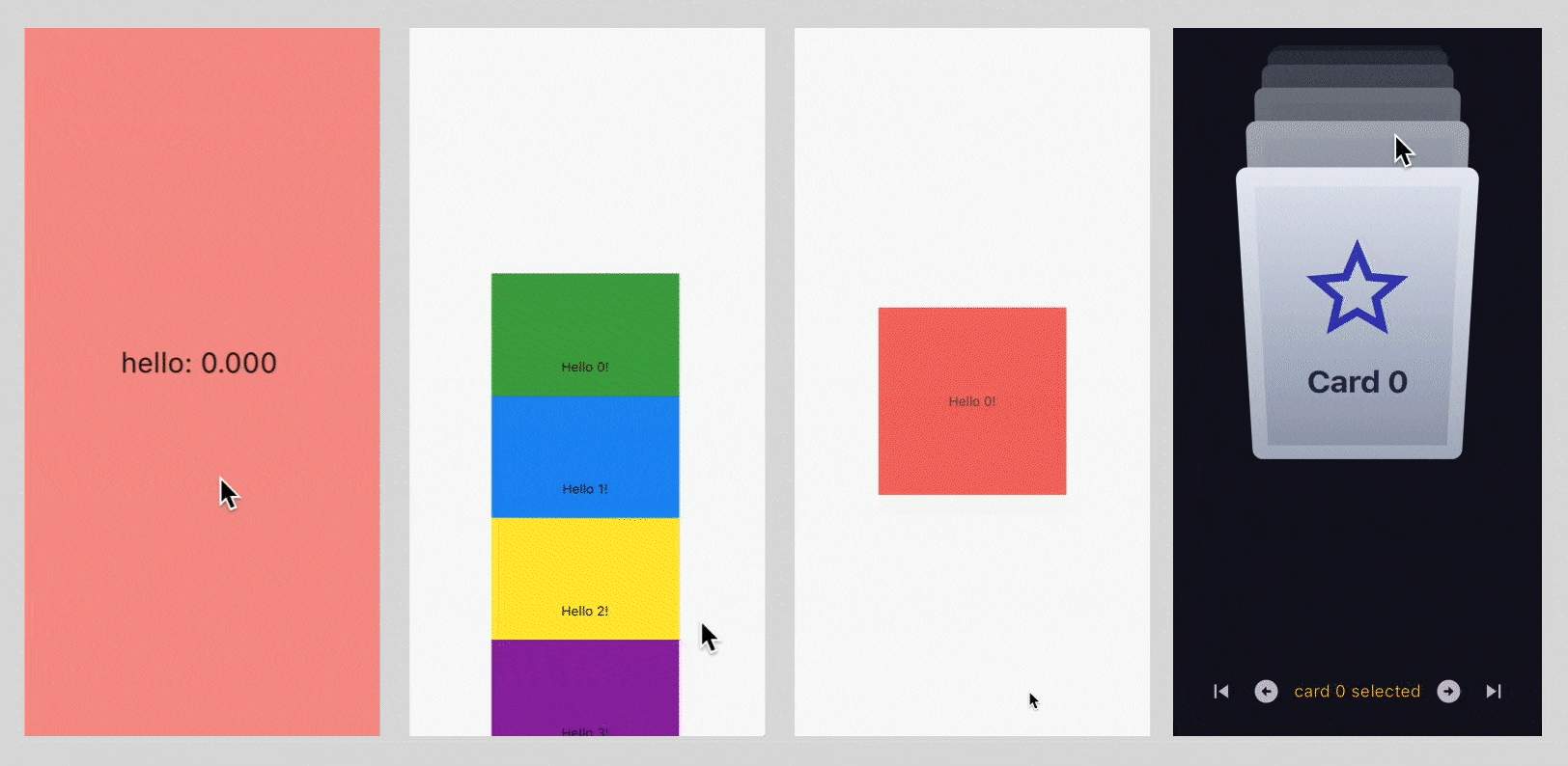
I started coding a prototype of the latter idea, building a widget that manages all of the tricky logic surrounding scroll interactions and physics, and leaves the visual presentation of children up to an effectsBuilder method. This method simply wraps a child in whatever effects or positioning widgets you want, based on a scrollRatio from -11
For example:
// very basic example that scrolls children vertically from -250px to +250px
CustomCarousel(
    effectsBuilder: (index, scrollRatio, child) =>
       Transform.translate(
            offset: Offset(0, scrollRatio * 250),
            child: child,
       ),
    children: [card1, card2, etc],
)
While playing around with this, I realized that almost every “effect” I wanted was already supported by our Flutter Animate package, so I also added an effectsBuilderFromAnimate helper method to make it easy to use them together:
// very basic example that scrolls children vertically from -250px to +250px
CustomCarousel(
    effectsBuilder: CustomCarousel.effectsBuilderFromAnimate(
        effects: EffectList().moveY(begin: -250, end: 250),
    ),
    children: [card1, card2, etc],
)
Once I had the basics working with a rough (and ugly) prototype, I put together a simple test harness app, and handed it over to our amazing design team to play with, explore capabilities, and provide feedback on the overall concept.
Jared, our Creative Director, is going to talk about that experience.
From concepts to code
Our prototyping typically takes place within a variety of UI, 3D and motion design tools — uncovering as much as we can to firm up the direction before we start building. While that workflow still helped us plan and design some aspirational concepts, with this project we went a step beyond, and did a lot of the ideation directly in the Flutter testing harness Grant provided.
Although our design team isn’t expected to write code, we all have Flutter installed and are familiar enough to run projects and collaborate with developers, especially when it comes to fine-tuning visuals, animations, and feel. Having the ability and confidence to jump into the code and work directly with the real thing led to more rapid and experimental ideation from our design team.
It’s worth noting, this wouldn’t be possible without a high attention to detail during development. Project structure, view cleanliness, proper documentation and intuitively designed widget properties are massive contributors to the success downstream users (especially us designers) will have with the code.
Getting Started
For all of our experimentation, we leveraged the pre-built effects in Flutter Animate. This isn’t the only way to define carousel behaviors, but as designers working with minimal coding capabilities it streamlined things a lot. It allowed us to approach visuals in a way that was analogous to tools like After Effects; layering on effects in a timeline.
From positional effects like align, move, slide and rotate, to more complex special effects like flip, shimmer and boxShadow — the basic parameters all work the same, and specific ones are surfaced with code hinting, or in the online Flutter Animate documentation.
Each time we’d save we were able to observe the changes in our running project in real-time with hot reload. Whether testing in a virtual environment or on a physical device, the instant feedback of those changes and ability to rapidly iterate is an empowering capability when designing and refining the experience.
Admittedly, it took some playing around to fully grasp how everything worked, and there were plenty of aha moments along the way.
Working with scrollRatio
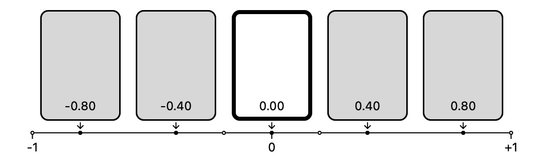
Understanding scrollRatio is foundational to working with CustomCarousel — it’s a value that represents a beginning, middle and end point for how effects are applied as the item scrolls.
If we think about this in terms of a normal vertical scrolling list, the scrollRatio is 1 when the item is at the end of the visible portion of the list (ie. has just scrolled into the viewport from the bottom).
Similarly, its scrollRatio is -1 when it is at the beginning of the viewport (about to scroll out the top).
A scrollRatio of 0 is a bit trickier, it indicates that the item has reached the “selected” position for the list. In a simple vertical scroll, that just means the center of viewport, but with more complex effects or playing with the itemsBefore and itemsAfter properties you can move this around.
Delay and duration
In Flutter Animate all effects run in parallel, but you can use delay and duration to modify the timing of when they run in relation to each other.
As discussed, CustomCarousel uses a scrollRatio value from -1 to 1; this doesn’t map directly to the time-oriented parameters in Flutter Animate. To make this work, the total duration of the effects is divided in half, with the first half mapped to the scrollRatio -1 to 0, and the second half to 0 to +1. Note that the actual duration doesn’t matter, just how it maps back to the ratio.
I found the easiest way to think about this was to make all my effects 200ms long, so I had 0-100ms as the “scroll in” time range, and 100-200ms as the “scroll out” time.
Flutter Animate also has some nifty logic where effects inherit their delay and duration from previous effects by default. This makes it really easy to synchronize a list of effects with each other, but can get a bit weird when we want to introduce more asymmetrical, sequenced animations to our carousels.
I found it was often easiest to just list out my effects in the order I needed them applied (as discussed below), and assign each an explicit delay and duration (and curve), bypassing the inheritance model altogether.
After I was done and handed off to Grant, he often tightened up the final implementation by leveraging inheritance, but I think he was just showing off because he wrote Animate.

Easing curves
One more interesting property available to every effect is curve. A familiar concept in animation, easing curves affect the characteristics of movement across a given duration. Does it start fast or end slowly, exhibit traits of elasticity or appear to bounce?
Curves can be applied to any of the Flutter Animate effects to achieve really great (and sometimes unusual) results around non-linear alignment, scale, or rotation transitions throughout a carousel’s duration.
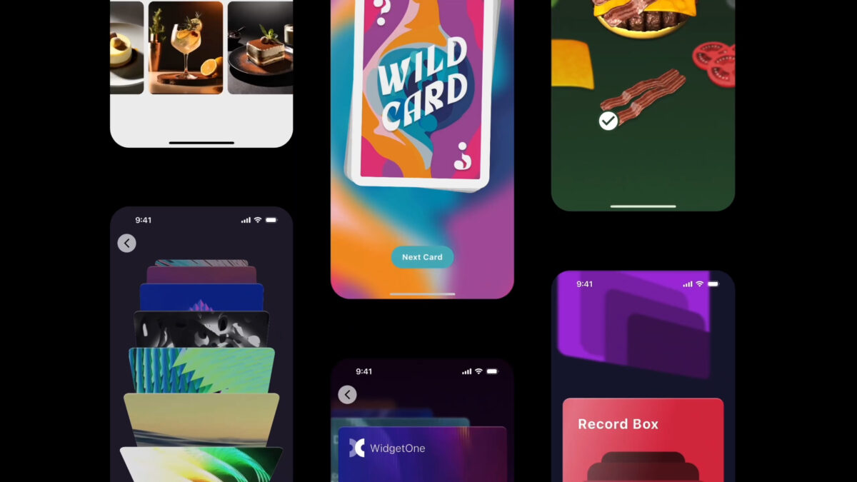
This was particularly helpful in our Records Box demo when trying to simulate a rolodex style animation but with a realistic sense of vanishing perspective around an arc.
Order up!
Because effects are applied in the order they are defined, knowing how to manipulate that to your benefit is key to achieving your desired effect and in some cases can have notable impacts on performance.
An illustrative example of this is swapping the order of align and rotate effects. If rotate is defined first, carousel items each receive rotation values spanning the alignment change in a straight line. If align is first, the items will be distributed positionally and then have rotation values applied to each step, causing the carousel items to follow an arc.

Less obviously, it is a good idea to add effects like blur and tint early in the list, so that they apply to the smallest screen area. For example, EffectList().blur().align() is more performant than EffectList.align().blur() because the former only applies the blur to the target item, where the latter applies it to the Align widget, which fills all available space.
Conclusion
We’re really pleased with how much functionality is packed into this seemingly simple widget. The more we played with it, the more it felt like a significant shortcut for creating highly expressive carousels in Flutter.
Of course, we’ve just scratched the surface when it comes to discussing capabilities, and complete instructions for use can be found in the official Flutter Custom Carousel documentation.
We can’t wait to see what you build!