
While building the Wonderous app, we wanted to craft a great experience for visually impaired users using screen readers. Flutter does an admirable job working with these systems out of the box, but app developers also have work to do to create a polished user experience.
In this post we’ll look at how screen readers work and then run through the top accessibility related lessons we learned along the way.
Screen readers 101
The most commonly used screen readers are Talkback on Android, and VoiceOver on iOS.
You can enable the screen reader on your device from the settings panel on your mobile device. For iOS, you will find it at Settings > General > Accessibility > VoiceOver, for Android, it is Settings > Accessibility > Talkback. Alternatively, you can use Siri or Google Assistant to toggle the screen reader using voice commands which can be quite helpful for testing.
When a screen reader is active, contents of the app will be read aloud as they gain focus. This allows visually impaired users to interact with your app, and for its content to be presented through a non-visual user interface. However, it also changes the fundamental mechanics for how users will explore your application.
There are two primary means of discovery/exploration when using a screen reader. Users can do a one-finger swipe right or left to traverse from one element to another. Conceptually, this functions quite similarly to the [TAB] key on a keyboard:
The other primary mechanic for discovering the interface is to drag around the screen with a single finger and select any UI elements that are touched. This allows users to understand where UI elements are positioned relative to each other:
Once a UI element is selected its semantic label will be read aloud. If the selected UI element is a button it can be activated by using a double-tap gesture.
With a basic understanding of how screen readers work, and their core navigation paradigms, let’s look at some of the things you can do to accessibility of your app.
1. Declare Header elements
Every screen in your application should try and declare a header to provide clarity about the function of that page. If you use the Material AppBar component this will be set automatically, otherwise you can use the Semantics.header API:
return Semantics(
  header: true,
  child: Text('My Title')
);
In Wonderous we created a shared SimpleHeader component that would wrap a semantic header and used it on many screens in the app.
Ideally, declare the header as the first semantic element on the page so that it is the first thing read. If this is not possible, you can use the OrdinalSortKey to provide a sort order amongst sibling widgets:
return Semantics(
  sortKey: OrdinalSortKey(0),
  header: true,
  child: Text('My Title'),
);
Unfortunately there is no global sort key when it comes to Semantics, so it may not always be feasible to have the header be first. Just do the best you can!
2. Require semantics for all buttons
It’s important that buttons are described properly as they are probably the most fundamental of all UI components. But it is easy in Flutter to use a raw GestureDetector or button and forget to provide a proper semantic label. This makes for a very poor non-visual user experience, as there are tappable regions that may provide no clue about what they do when tapped.
To avoid this, it’s a good practice to create a custom button or gesture detector for your app, with a required semanticLabel parameter, and use it everywhere.
class AppBtn extends StatelessWidget {
  AppBtn({
    Key? key,
    required this.onPressed,
    required this.semanticLabel,
    required this.child,
  })
  ...
}
This will require all the buttons in your app to provide a semantic description by default and make sure nothing slips through the cracks. You can see how we did this in Wonderous with our AppBtn component:
AppBtn(
  semanticLabel: 'View artifact details,
  onPressed: () => _handleImagePressed(context),
  child: ...,
)
We used this strategy of making accessibility a requirement by default throughout the app, and found it was very effective.
3. Use ‘liveRegion’ for content that should be read when changed
It is often desired to have content read automatically to the user as the result of some action. For example, they may press a button to advance through a tutorial, and the next step of the tutorial should be read automatically, as opposed to them having to manually select it.
Use Semantics.liveRegion for this:
Semantics(
  liveRegion: true,
  child: TutorialContent(_currentIndex),
),
This will hint to the screen reader that this content is important, and it may read it when it changes. Another common use case for a live region would be something like a snackbar or notification tray.
We used this in several places within Wonderous, such as the IntroScreen and the WondersHomeScreen.
4. Use ‘onIncrease’ and ‘onDecrease’ to deal with horizontal lists
As discussed at the top of this post, screen readers will naturally consume any horizontal swipes, using them to navigate between different semantic nodes. This creates a problem for any horizontal lists (aka. carousels) you may have in your app as it blocks their core navigation mechanism. Some screen readers do support a multi-finger horizontal scroll, but it can be tricky to use when the screen is crowded with other UI elements.
A nice solution for this problem is to create what is commonly called a counter or slider control. Swiping up will increase the current page by one, and swiping down will decrease it. This allows users to select the horizontal list, and flip through its contents very easily, and it also informs the users that these actions are available.
To do this in Flutter is very easy, just implement Semantics.onIncrease / onDecrease around your lists:
Semantics(
  liveRegion: true,
  onIncrease: () => _setPageIndex(_index + 1),
  onDecrease: () => _setPageIndex(_index - 1),
  child: PageView (
    ...
  ),
),
With the combination of liveRegion and the increase/decrease handlers, the user will be able to select the PageView, flip up or down, and have the contents of each page read to them. This will vastly improve the user experience in these situations.
You can view examples of this within Wonderous on the IntroScreen and WondersHomeScreen.
5. Use ‘MergeSemantics’ to Group related content
Flutter will create a semantic node for all Text widgets by default, but it does not understand anything about how to group them. As a result each element will be read individually which can create a poor experience for the user.
To reduce the burden of navigating and understanding the application, you can use the MergeSemantics widget to group related elements into a single node:
This is a very easy and effective way to improve the overall screen reader experience. We used this in many places in Wonderous, such as _TitleText and the TimelineEventCard.
6. Be careful with ‘IgnorePointer’
By default, when you use an IgnorePointer widget, all semantics below that Widget will be ignored. Often this is not desired. For example, you may have a title text, floating on top of a full-screen PageView that is swipeable. The title text should be part of the semantic tree, but you don’t want it to block pointer events.
In cases like these, use IgnorePointer.ignoringSemantics:
return IgnorePointer(
  ignoringSemantics: false,
  child: _PageHeader(),
)
This will stop the element from blocking any pointer events, while still allowing it to be seen(and selected) as a semantic node by the screen reader. We used this in Wonderous for the title text on the WondersHomeScreen because it was sitting on top of a swipeable PageView component.
7. Use ‘ExcludeSemantics’ to reduce clutter
Often you may have elements on screen that have no semantic value, like an abstract background image or repeated content. In cases like these, it’s beneficial to remove the node from the semantic tree, to reduce noise the user has to step through.
You can do this with the ExcludeSemantics widget:
return Stack(
  children: [
    ExcludeSemantics(child: _SomeUnimportantImage()),
    ...
  ]
)
You can also make use of ExcludeSemantics in a dynamic way. For example, you may have a grid of items, but only want the selected item to have a semantic node. You could do that with something like this:
GridView.builder(
  itemBuilder: (_, index) {
    bool exclude = index != _currentIndex;
    return ExcludeSemantics(
      excluding: exclude,
      child: _GridItem(index),
    );
  },
  ...
),
An example of this in Wonderous is the _InfoRow component where we dynamically ignore any rows without content so the user doesn’t waste time on nodes with no information of value.
8. Properly implement tab menus
When creating a custom tab menu, it is important to provide a label for each button that indicates it is part of a larger menu. Typically, this will be something like:
return AppBtn(
  semanticLabel: 'Image Gallery: Tab 1 of 4"
)
This is a small change, but is very important semantically, ensuring the user understands the high level navigational flow.
MaterialLocalizations provides a standardized way to build this label. For example:
final MaterialLocalizations localizations = MaterialLocalizations.of(context);
String tabLabel = localizations.tabLabel(tabIndex: index + 1, tabCount: tabs.length);
return AppBtn(
  semanticLabel: 'Image Gallery: $tabLabel"
)
You can see how we did this in Wonderous in the WonderDetailsTabMenu component:
9. Fully Describe Semantic Elements (like Page Indicators)
It is important to really analyze the various visual cues in your app, and try to fully describe what information they are imparting to the visual user.
For example, consider a simple page indicator like this:
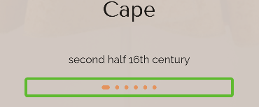
On it’s face this is only a series of dots. But if you think deeper about it, its semantic value is actually quite significant. It says at least three things to the visual user:
- There are X number of pages to view
- You are currently on page Y
- You can swipe horizontally to navigate to other pages
It can be easy for a sighted user to take these cues for granted, so it’s important to ask yourself if there are any interactions or content that could use a better explanation, or where information is somehow getting lost.
Check out AppPageIndicator from Wonderous to see the source code for the indicator shown above.
10. Have a minimum size for your semantic elements
One of the primary ways to discover UI for a screen reader user is to drag a single finger around the screen to discover semantic nodes. This means that very small semantic nodes can be hidden from the user.
Try to have a minimum size of 30-40px for all semantic elements and allow them to take up unused vertical or horizontal white space where it makes sense. This will result in an interface that is friendlier to users of a screen reader, saving time and frustration.
We implemented this in Wonderous was with _EventMarker on the global timeline. They are visually very small, but we added additional padding so they could more easily be discovered using a drag gesture:
Making your app accessible to more people is a huge win for everyone, and hopefully these tips help make it easier. By making accessibility the default, and implementing it from the start of your project, you’ll find it happens naturally and requires fairly minimal additional effort. You’re likely to gain additional insights on the structure and usability of your app for sighted users along the way.
More Information
If you’d like to learn more, check out the Flutter Accessibility docs, take a look at the source code for Wonderous, or read about the benefits of inclusive design.
Super article, thank you for writing this.
Un post muy detallado. Muchas gracias por compartir.
I’m still new to Flutter, but so far it has been relatively easy for me to learn. Before this, I was using Django to build web apps. But, I recently got hired by a startup to build an app using Flutter, so here I am.. This guide was excellent, thank you!
To now more together
To receive exam because I am a student
I have only just got home from school