Back in May, the organizer of CAMP approached gskinner to create a site to promote their festival. For those who don’t know, CAMP is a festival held in Calgary every year that describes itself as: “…a non-profit organization celebrating the art and technology of creative storytelling. We bring together like-minded professionals, artists, educators and students to share and shape experiences that educate, challenge and inspire.”
The original ask for the site was open-ended: something to do with digital nature, mental health, and flowers. That got our team excited since there were a lot of creative possibilities within those parameters. The following is the process behind how we ran with those early ideas and formed them into the final design.
Background Information
To start the design process, we needed to gain a strong understanding of what CAMP was about. We sat down to chat with the organizer of the festival to get a better sense of this year’s theme and direction. We learned about how CAMP was expanding to accommodate more attendees and workshops. Additionally, the venue would be changing to Mount Royal University, which notably has a ceiling design inspired by a wild rose.
After discussing the basics, we dove into the theme of this year’s festival: mental health. We asked why CAMP had chosen a more sensitive subject. The organizer wanted to divert from the norm and discuss what usually goes unmentioned in the creative fields. Most of the time there is a focus on the successes and accolades won, but rarely do people mention the burnout. The goal was to have more discussion about the ups-and-downs of creative work. How do people cope with failure or feeling lost? Can we discuss and show what that looks like? Why is there such a duality in these fields? These were the types of questions that would be addressed.
We expressed how we wanted to create a site that helped tell that story and a feeling to create something memorable. The challenge we faced was finding a way to express the notion of ups-and-downs in a way that didn’t repel site visitors, but made them intrigued in the festival.
Generating Ideas
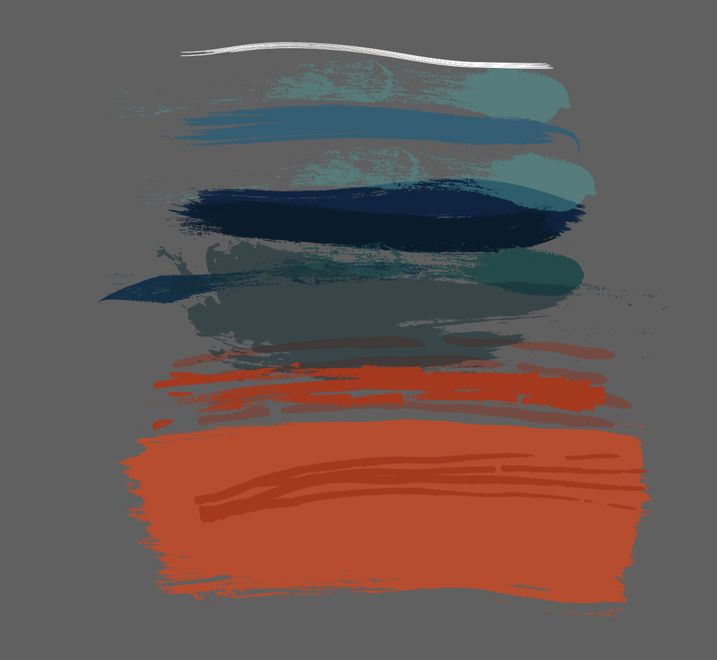
Using key phrases pulled from the previous discussion, we created a mood board. Initially, it took a darker tone, focusing on stark contrast and shapes. After some internal discussion, we realized that such a tone would not attract our intended audience to attend the festival. Then, we started aiming towards a more hopeful tone since it would send a more appealing message to site visitors.
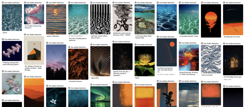
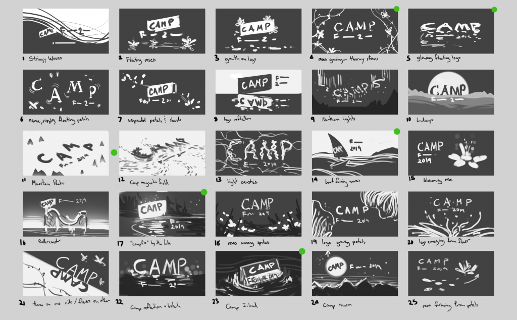
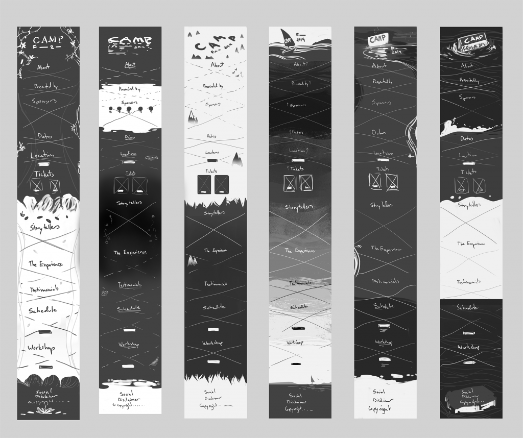
Once we had a mood board guiding us, it was time to expand upon those initial ideas. We created a series of thumbnail sketches to see what rough ideas could reflect the festival’s theme. Referencing back to the mood board and written notes helped make sure we were on track during this process. From these sketches, a recurring metaphor seemed to emerge. It seemed to represent the ebbs and flows of a career and the reflection of one’s mental state better than the others. That comparison? Water. Water seemed like a strong candidate for a visual metaphor since there are so many emotions tied to it. One moment it’s the source of life and joy, the next, a dangerous body that anyone can get lost in. The water concept also had a lot of potential for interaction ideas, so we kept that concept top of mind.
Developing Ideas Further
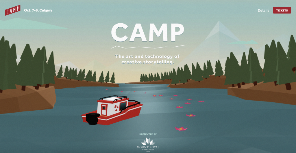
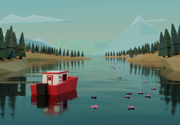
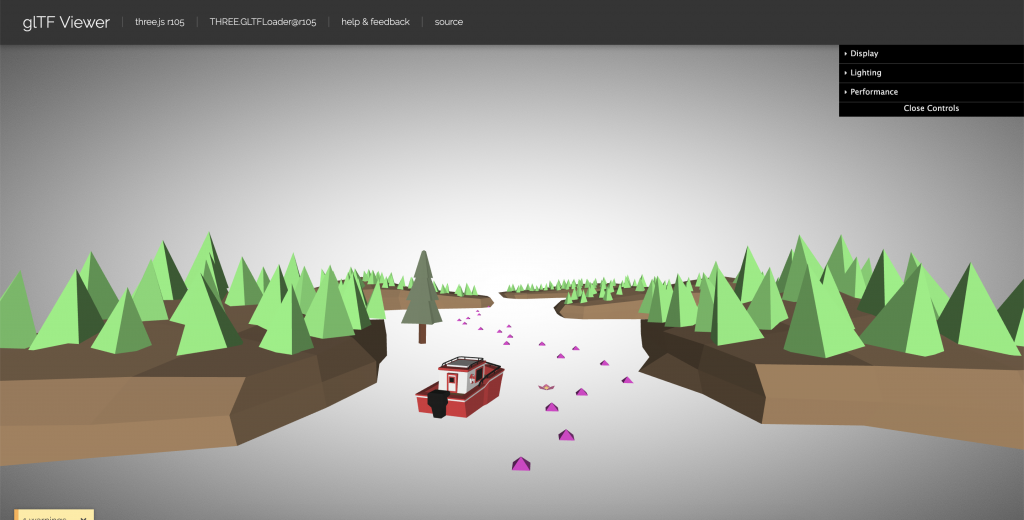
After some more discussion, we narrowed down our thumbnail ideas based on strength of the idea and technical feasibility. Another factor that helped direct our decision was our team’s excitement for the idea. Designing always feels better when you’re passionate about the idea. Once we had our selection narrowed down, we sketched out what a full site page could potentially look like for each sketch. This allowed us to see how the themes could be elaborated on and what the pacing of the site would look like. After that, we could see where certain concepts didn’t have as much potential as others. After more internal and external discussion we narrowed down the ideas to one. The concept was a boat (representing the site visitor) going on an unexpected journey.
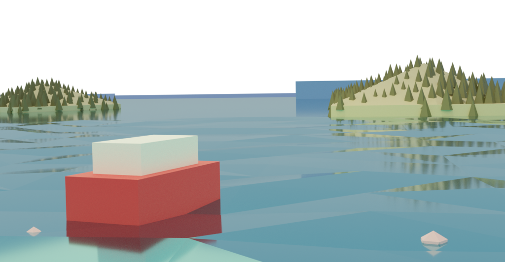
We wanted to tell a visual story where your boat has its own ups-and-down, but still has a hopeful conclusion in the footer. Originally, the concept was of a sailboat on the open ocean. After further discussion, the location of the boat was moved to somewhere that felt more like Alberta where the festival takes place. The boat itself turned into a fishing boat with windows to create a bit of mystery of who was inside the boat.
Making Mockups
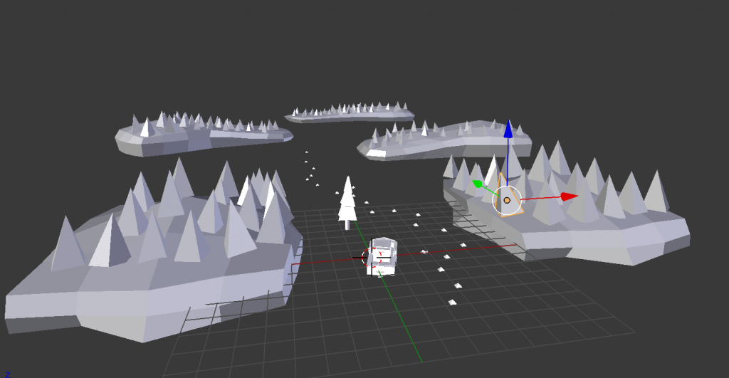
Diving into development we chose to incorporate 3D into our final designs to create a novel look and experience. This would bring some challenges regarding file sizes, so we chose a low-poly look as a result.
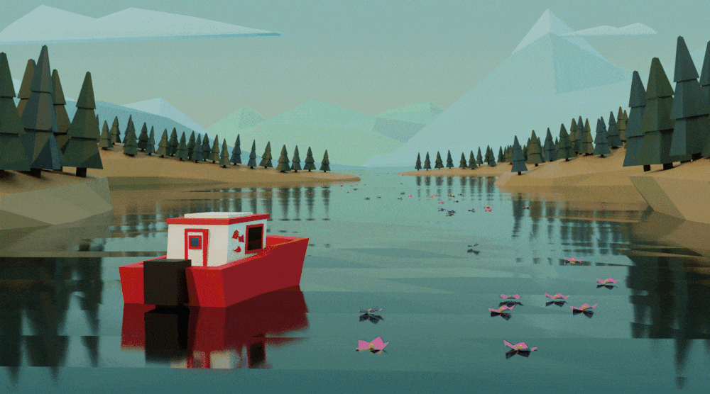
First, we started modelling out the header and footer scenes. Our goal now was to get the right mood for both the header and footer with the use of lighting and color. Light and color gave us an opportunity to strengthen the visual story by showing a passage of time between the header and the footer.
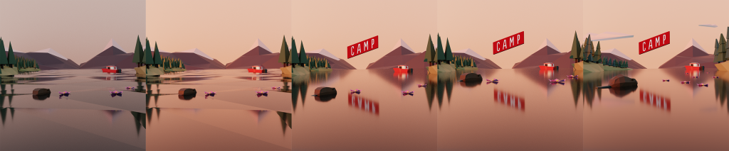
We also experimented with the possibilities of motion at this stage. With some rough and quick renders, we could explore what water or the boat sinking looked like.
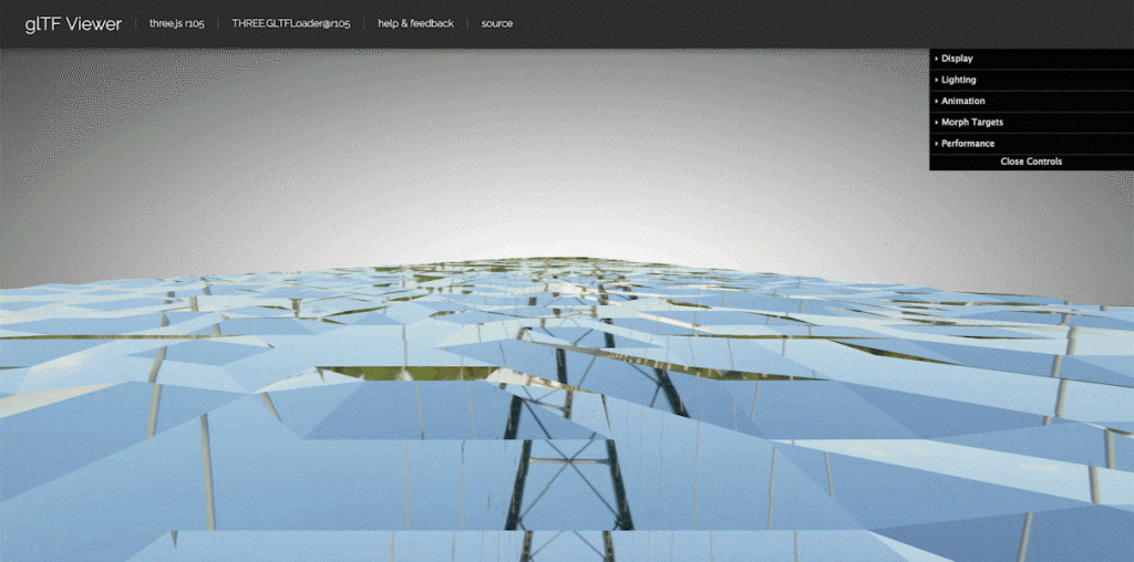
For the site body, we planned brush-like textures to represent the creative fields. Soon we realized that textures, even from vector brushes, were going to be too demanding when it came to file size. Balancing the visuals with site performance became a bit of a recurring theme on this project. To maintain that sense of change, we opted for a color gradient so that we would still get mood transitions throughout the page.
Production Assets
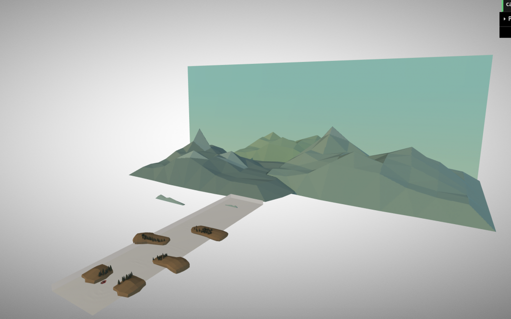
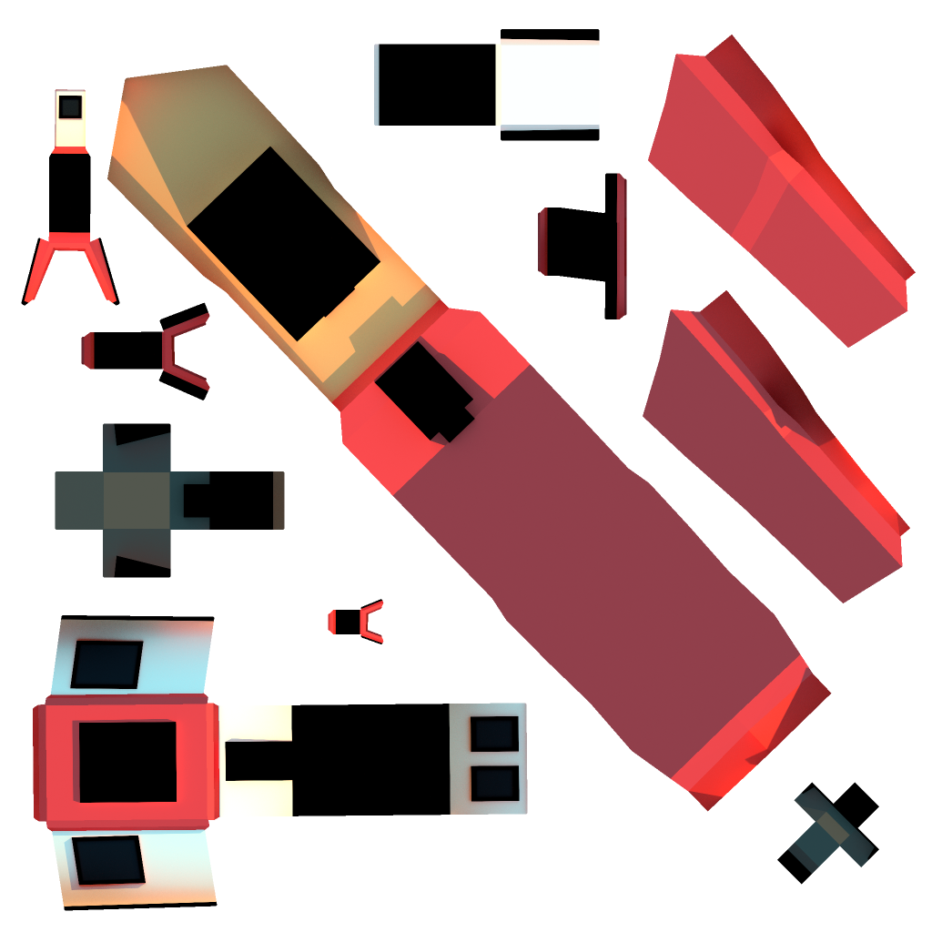
After the mockups were approved, we started working on the actual assets that would be used on the site. This process involved a lot more experimentation than previously expected. Since the 3D scene we were building could easily be many megabytes in size, we had to be smart with our file exports.
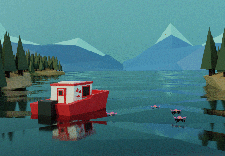
At first, we baked textures onto our meshes and baked a water animation into the scene. Unfortunately, the resulting GLB file was too large from the UV maps and keyframes.
As a result of file size constraints, we opted for using materials with a GLTF shader rather than any UV textures. Animated water was also replaced with coded water. Ultimately, this gave the site a different look than the original mockups, but that’s to be expected when comparing real-time rendering against raytraced animations.
Conclusion
Like the theme of CAMP, we too experienced some ups and downs while making this site, but we’ve learned along the way. We learned that when working in something as finicky as 3D for the web, be prepared to make compromises. What can help set expectations is having frequent dialogues between stakeholders to discuss what can or can’t be done.
Finally, we hope you enjoy the site and go purchase a ticket if this event interests you. There will be a lot of amazing speakers, plus we’ll be giving our own talk on Design at the festival. Check out our speaker pages here: camp.site/#chris_kohanik and camp.site/#kia_valdez