Five years of studying architecture, over two years of grinding in the industry, and one devastating thought — Do I want to keep doing this? Was this another period of burnout? I don’t think so. But was something new sparking? Maybe…
Let’s rewind a little. In 2020, I completed my architecture degree. With relief and dark circles under my eyes, I was excited to explore the practical world of architecture, eagerly anticipating the adventures that awaited.
It seems like the first thing I built was a castle in the sky. After years spent in the industry, the stagnant design practices began taking a toll on me. The never-ending longing to see my designs come to life, not a lot of creative freedom, and giving way more than I got back… it started to drain me!
The most fulfilling part of my career as a professional architect was seeing my conceptual designs become a reality — a tangible product. This involved merging technical and creative solutions to ensure effective planning. As my journey progressed, I found myself naturally drawn to the exciting world of product design as it resonated with the same principles and aspects that attracted me to the field of architecture. I was initially worried about underutilizing my degree, but I discovered that it in fact enhanced my readiness for this new role! My background fostered a holistic perspective, enabling me to prioritize both form and function in product design.
My time at gskinner has been incredibly insightful, unveiling significant parallels between these two fields.
Understanding the shared roots
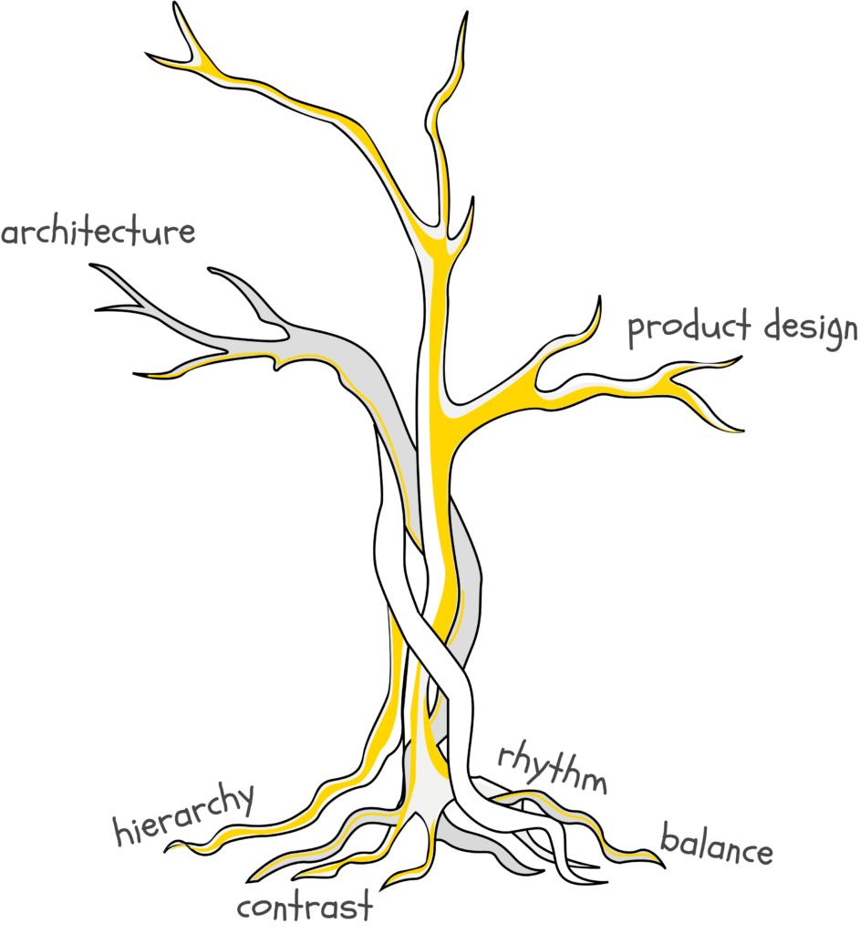
One of the first subjects we were taught during our undergrad was understanding design fundamentals and how to intentionally use them to create functional and appealing spaces. While working with billionBricks on details for powerHyde; a self-sufficient carbon-positive home for the underprivileged, our team was responsible for integrating the prototype design with the local village fabric in India. Drawing on the principles of balance and rhythm, we blended locally sourced materials that aesthetically connected the unit with its environment.
Applying these principles to my work in product design, these fundamentals continue to inform my design approach. For example, effectively using contrast on interfaces — highlighting important areas, guiding user attention, and making Call to Action (CTA) buttons stand out — significantly boosts user engagement and interface functionality. Selecting color palettes and typography mirrors the material choices in architecture, aiming to evoke specific emotions.
Whether in digital interfaces or physical spaces, a clear hierarchy enhances functionality and user experience in both fields. It’s interesting to see how the shared roots of design branch out into different creative realms!
Assembling an Experience
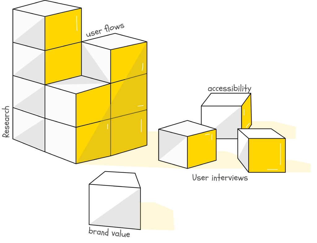
I remember my first project at gskinner was designing an NFT art generation app. You can imagine the pressure I felt of this being my first project at a new company, and it being about a newly emerging technology. I got my creative wheels turning by imagining how I’d design a complex building — understanding the requirements, planning the layout, mapping the user journey. Connecting these two separate worlds made me realize that both architecture and product design are both about making sense of complex requirements.
Both fields, although different, share a common goal; to craft functional and appealing spaces that are easily navigable. Architects design blueprints to seamlessly connect components of a building; prioritizing accessibility and inclusivity for everyone while considering functionality and proximity. Similarly, when designing digital products, product designers plan how users navigate the space, where they start, and what steps they need to take to reach their goals. Both fields adhere to accessibility guidelines, manage user expectations, and integrate features that mirror the thoughtful integration seen in both physical and digital planning.
Walking in the User’s Shoes
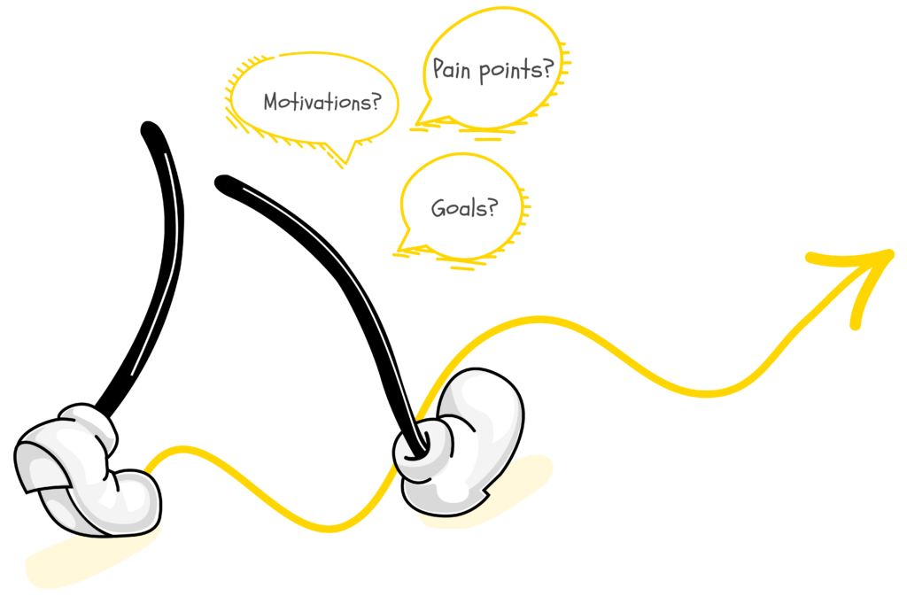
As an architect, I practiced visualizing living in the space as a user before starting with the designs. Why? Because I knew I wasn’t just building a house, hotel, or villa, but rather creating an experience. Understanding the target user plays a critical role in architecture. Who would be using the space? What are their needs, and goals? What do they want from this experience? For example, is it a playground for children or a recreational space for adults?
Designing digital products also requires a deep understanding of user expectations, especially when catering to diverse user groups. At gskinner, our team is creating a suite of apps for a company that serves both professional and first-time users. Their interface and user experiences differ, highlighting the importance of tailored design strategies. By aligning design decisions and understanding each group’s specific needs, we improve usability and create a better overall user experience.
Whether physical or digital, it’s about creating spaces where users can thrive, find what they need, and ultimately have a positive, meaningful experience. Both fields revolve around making the users’ needs the ultimate priority, and ensuring that they have an experience that’s as effortless as possible.
Teaming Up, Syncing In
While overseeing an interior design project with an already tight deadline, Covid’s sudden arrival piled on unexpected obstacles just as we were about to finish. This situation prompted me to collaborate closely with our tradespeople, fostering a deeper appreciation for their roles. Understanding their perspective and methods enabled me to improve communication, streamline designs, and ensure clarity in drawings, ultimately leading to the successful completion of the project within our deadline.
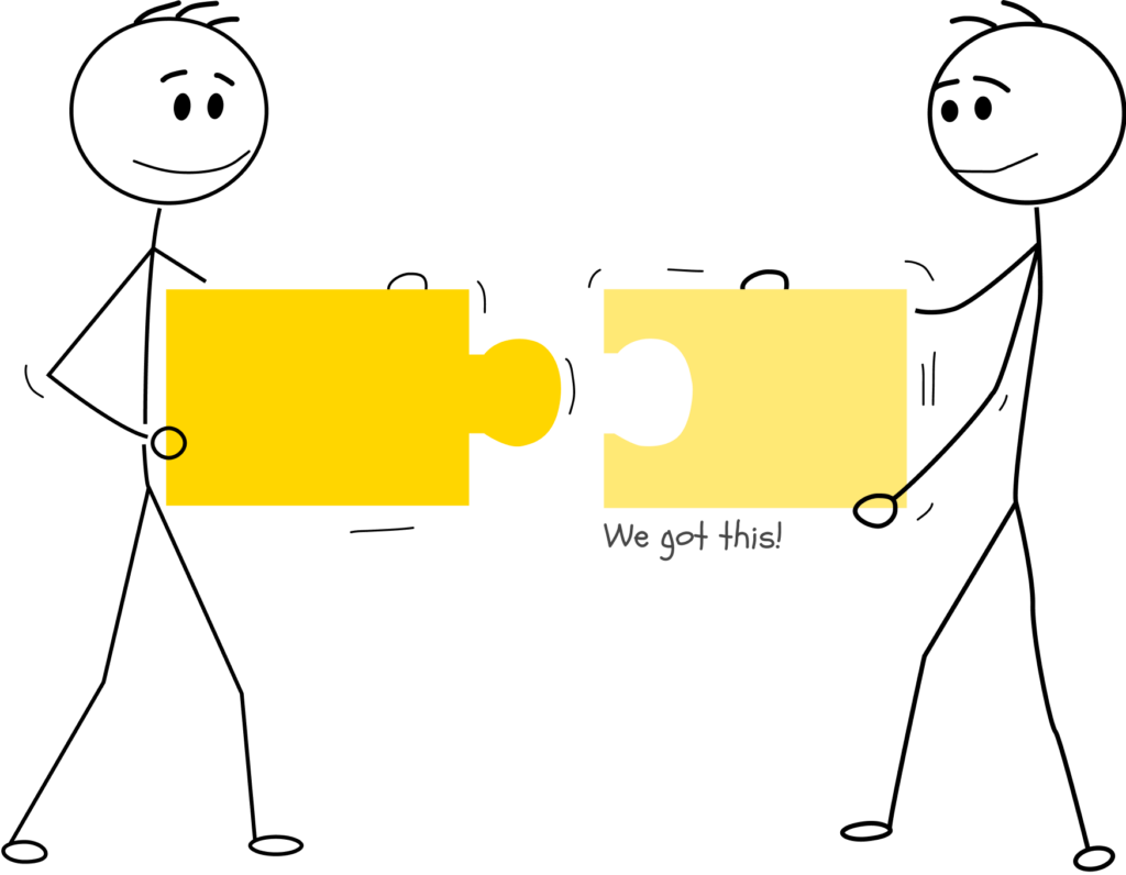
Drawing from that experience, I realize that product design too doesn’t end at just designing. The challenge remains the same; articulating your design vision to everyone involved throughout the project and recognizing that each individual has a distinct role to fulfill. By fostering open lines of communication, I help uncover discoveries and facilitate decisions that might otherwise be challenging to reach. This involves maintaining transparent communication channels with various stakeholders. For instance, I regularly collaborate with project managers to ensure timely task delivery. When presenting designs to clients, I emphasize how they impact usability, aiming to cultivate a deeper understanding and alignment with the product. Additionally, I collaborate with the development team to address design challenges, integrate changes, and gain insights into the implementation process. This collaborative approach ensures a cohesive workflow and enhances overall project effectiveness.
Whether drafting blueprints or crafting wireframes, these two skills — communication and collaboration — are the bridge that connects creative design ideas to real-world execution.
Iterative Progress
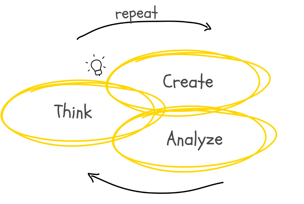
Whether grinding through caffeine-fueled thesis nights or navigating the architectural field, one constant remained: the loop of think-create-analyze repeat. In architecture, the first blueprint rarely equals the final product, but rather it’s an iterative cycle that brings visions to life. This iterative mindset came with me to gskinner, where working on a project reinforced that the first idea is key, but is rarely the final one. We thrive on constantly tweaking, giving, and receiving feedback, and trying different approaches until we find the right solution. It’s a shared commitment to the refinement and testing that ensures both physical and digital creations become their best versions.
Reflecting on my journey made me realize that my five years of crying over walkthroughs, site plans, and structural analysis weren’t in vain. All of these hardships prepared me for my role in product design. Even though the terms and tools might change, the iterative mindset of continually refining solutions to problems remains the same. So, if you love creating, collaborating, and seeing visions come to life and are contemplating whether to switch or stay on the fence, my advice is *drumroll*– go for it!
See you on the other side? 🙂


What a fantastic read! The intersection of product design and architecture is truly fascinating, and your insights highlight the innovative possibilities within these fields. Thank you for sharing such an inspiring and informative article!