Earlier this year we joined forces with the FlutterFlow team to produce a set of “Vignettes” to showcase the power and customization possible inside of FlutterFlow. Recently we deployed them to the FlutterFlow Marketplace so that everyone can dive in and see the techniques that made these components possible!

Last week we discussed the Vignettes from a high-level design perspective but now, with the Vignettes publicly available, we thought we’d explore some of the more interesting technical components, and look a little deeper at how these demos were built.
As we go through these examples it’s important to note that one of our explicit goals was to use as few Custom Widgets as possible, we really wanted to push FlutterFlow itself and see what could be built with the native component system and built-in widgets.
In this initial post we’ll dive into the AI Caption Generator Vignette with future posts coming soon on the Fitness Onboarding and Smart Home Hub vignettes.
AI Caption Generator
This project features several interesting components that we’ll take a look at:
- Custom Sliders
- Dual-Axis Sliders
- Multi-modal AI integration
Custom Slider
One of the first components we knew we would need were fully bespoke Slider controls. Our initial concepts were far outside the stock Material look and there was no way we could adequately customize them using the available settings.
This meant we needed to make sliders completely from scratch and without using any Custom Widgets… an interesting problem! In the end we came up with two methods for doing this.
Method 1) Invisible Slider
When we first began work on the project there was no ability to get gesture events. The workaround we developed was to use a Material Slider set to 0% opacity. You can listen for changes on the invisible slider and map its value to various widget properties to quickly create a custom slider:
This works great for certain use cases and remains a nice simple way to create a custom slider, but we knew it was not going to be sufficient for our needs. Some of the more advanced components we had planned, like Vertical Sliders, Height Sliders and Dual-Axis Sliders, would just not be possible.
What we really needed was the full GestureDetector API which is built into Flutter…
Method 2) GestureDetector + CustomAction
When we brought the problem of missing gestures to the FlutterFlow team they immediately saw the value in the feature and set about adding it. With the 50+ GestureDetector actions in hand we were able to construct custom sliders fairly easily.
Let’s take a quick walk through the process below.
- Step 1) Add Gesture Event
The first thing you need to do is add an OnHorizontalDragUpdate action to a Container or Stack at the root of your Component and get the localX position of the pointer.

- Step 2) Convert px position to normalized position
Now that we have the localX pixel position, we want to convert that into a “normalized” 0-1 number which we can use to represent the current logical value of the slider.
We can do this with the simple math equation ofvalue = position / width, but that requires knowing the total width of the control.
We could hard-code a width value that would be hard to maintain and limit the flexibility of the control. Instead we want to do something more dynamic where we can automatically get the size of the current control, whatever it may be. Normally in Flutter we would use a LayoutBuilder to get this but that’s not possible currently in FlutterFlow 🙁
Fortunately, there is a workaround you can do using a Custom Action withBuildContextaccess, which you can see below. It attempts to find aRenderBoxfor your current context, and with that it can determine the current width of the control. Using that width we can calculate the 0-1 value.
Future<double> getNormalizedXFromLocalX(BuildContext context, double localX) async {
  /// Cast the context to a RenderBox so we can get the size
  RenderBox? renderBox = context.findRenderObject() as RenderBox?;
  if (renderBox == null) return 0; // renderBox is rarely null, but we should handle it just in case.

  /// Get normalized (0-1) value on the horizontal axis
  return (localX / renderBox.size.width).clamp(0, 1);

}
To recap: In the above example we passed localX pixel value to a Custom Action getNormalizedXFromLocalX which calculated a value of 0 – 1 where 0 is the left-edge and 1 is the right-edge of the component. This means that as the user moves their finger across a component from left to right, this value will increase from 0 -> 1. We refer to this value as the “normalized value”, or normalX.
With your normalized value in hand your custom slider is almost complete!
Step 3) Execute onChanged Callback
Now that we have a modified value for the slider, we need to let other actors in the app know about it. To do this you can dispatch the value via an Action Parameter, emulating the behavior of the built-in Slider control:
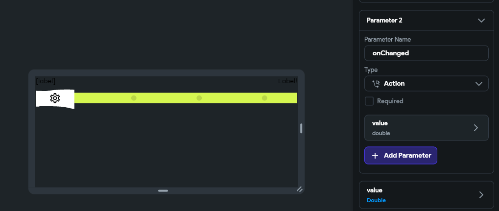
onChanged event and update the app state accordingly!
Step 4) Update slider visuals according to ‘value‘
The last step to the custom slider is the visuals! The easiest way to do this is to take the 0-1 value and map it to different widget properties to visually represent the current value of the slider.
There are many properties you could conceive of, but some common ones we use are:
- Bind to alignment X or Y (-1 to +1) so you can move a drag handle horizontally or vertically as the value changes
- hzAlign = -1 + value * 2
- Bind to scale to make an object change size as the value increases
- scale = .75 + value * .5 (75% -> 125% scale)
- Bind to opacity of some object
- opacity = .5 + .5 * value (50% -> 100% opacity)
- Show the value in text form. As a numeric value or even a list of labels mapped to the value
- label = formatAsPercent(value)
- label = labels[(labels.length-1) * value]
The simplest way to do these calculations is in a Code Expression but you can also move them into a Custom Function if you want to keep your UI bindings clean and lift the code up out of the view so it’s a little easier to maintain in the future.
If you’d like to analyze this approach directly check out the Caption Generator Vignette and look for the CustomSlider component. In that example we mapped the value to the horizontal alignment of the handle as well as lists of plain-english text labels:
Dual-Axis Slider
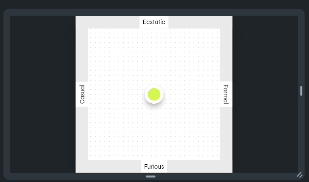
Building on top of the concept of a custom slider that moves on a single horizontal axis, is a slider that can move in both directions.
This is achieved quite similarly to the single-axis slider with a few small differences:
- Listen to the OnPanUpdate action instead of OnHorizontalDragUpdate
- Calculate both a normalX and a normalY value where top-left is 0,0 and bottom-right, is 1,1.
- Dispatch both an xValue and a yValue
In order to calculate the 2 values you can use a slightly more complicated custom action. It still relies on the RenderBox trick, but it calculates values for both the horizontal and vertical axiis:
Future<Vector2Struct> getNormalizedValueFromLocalPos(
    BuildContext context, Vector2Struct localPos) async {
  /// Cast the context to a RenderBox so we can get the size
  RenderBox? renderBox = context.findRenderObject() as RenderBox?;
  if (renderBox == null) return Vector2Struct(dx: 0, dy: 0);

  /// Get normalized (0-1) value for the X and Y relative to the size
  Size size = renderBox.size;
  double normalX = (localPos.dx / size.width).clamp(0, 1);
  double normalY = (localPos.dy / size.height).clamp(0, 1);
  return Vector2Struct(dx: normalX, dy: normalY);
}
You may notice in this example that we have created a Vector2 custom data type which holds a pair of dx and dy values. This just makes it easy for us to return both values from a single action, rather than having to make two different action calls.
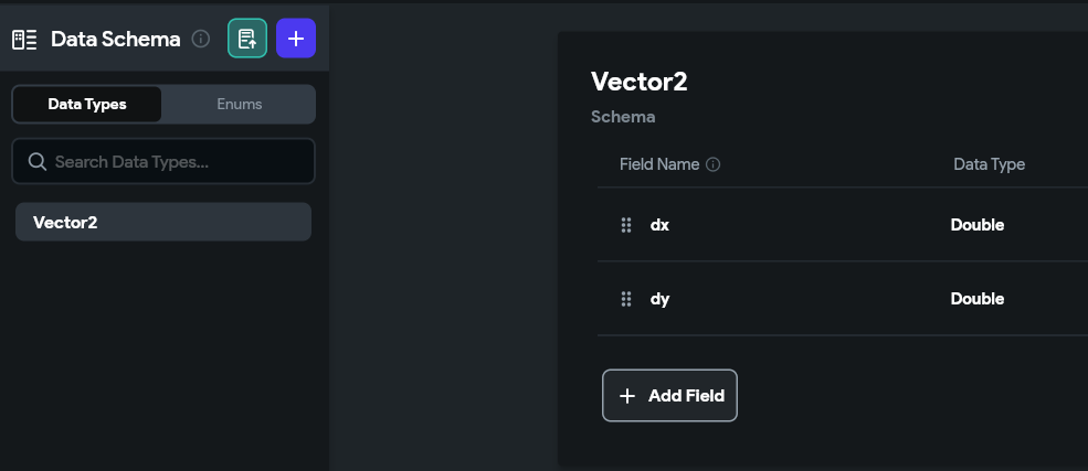
Offset class for this, but it’s not currently available in FlutterFlow as a type 🙁
Similarly to the single-axis Custom Slider, we need to inform other actors in the app when things have changed, but this time we need to deal with 2 values instead of 1.
In the screen-shot below you can see the onChanged(double xValue, double yValue) action callback, as well as double xValue and double yValue params.
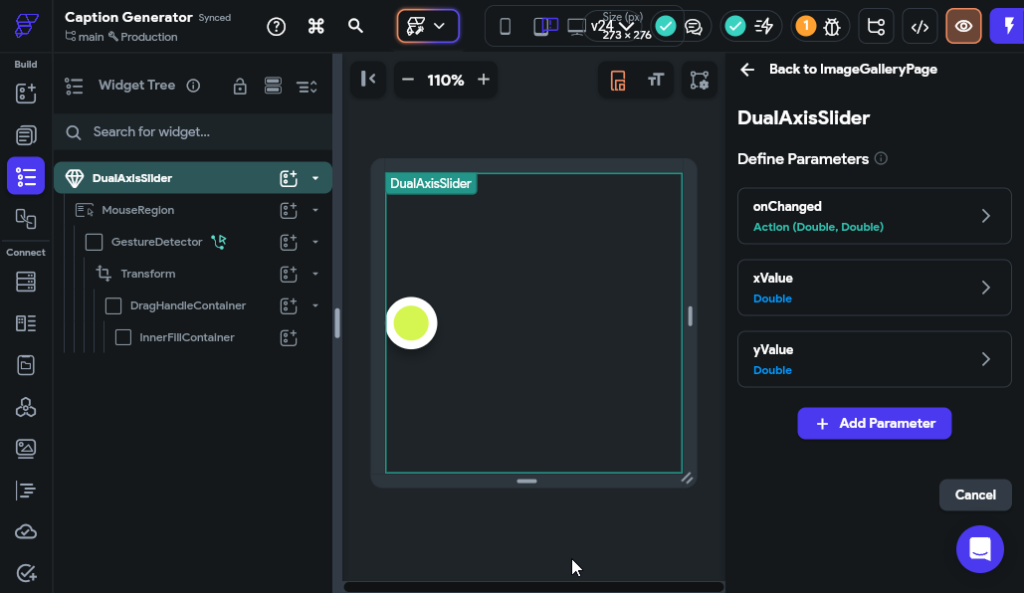
Finally we need to represent the current value visually, so we mapped the X and Y alignment of the handle to valueX and valueY respectively:
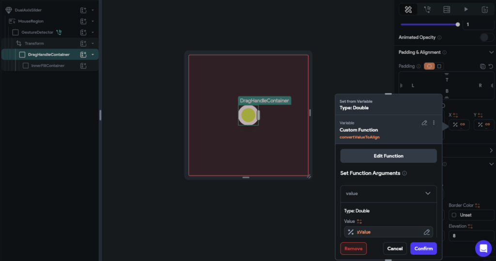
You might notice the convertValueToAlign method in the screenshot above. Because our value is 0 to +1, and Flutter Alignments are -1 to +1, we need to do a bit of math to transform the value to an alignment. This was easily done with a custom function:
double? convertValueToAlign(double value) {
  /// MODIFY CODE ONLY BELOW THIS LINE

  return -1 + value * 2;

  /// MODIFY CODE ONLY ABOVE THIS LINE
}
With that you have a fully functioning dual-axis slider!
Multi-modal configurable AI
In order to accomplish its core goal the app needed to send both an image url and a text prompt to an online API (like ChatGPT). Combining multiple types of media in an AI call this way is commonly referred to as multi-modal AI.
Spoiler alert: this ended up being surprisingly easy!
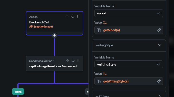
We quickly set up the OpenAI API calls and injected a number of variables into the prompt using FlutterFlows drag & drop interface:
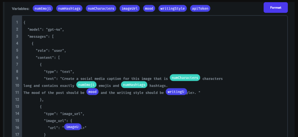
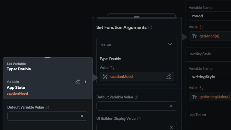
We converted the values from the Custom Slider and Dual Axis Slider into prompt values, using a few Custom Functions. For example:
String getCaptionMoodByNormalizedValue(double value) {
  /// MODIFY CODE ONLY BELOW THIS LINE

  final moods = [
    'Ecstatic',
    'Very Happy',
    'Happy',
    'Neutral',
    'Annoyed',
    'Very Annoyed',
    'Angry',
    'Furious'
  ];
  final index = (value * (moods.length - 1)).round();
  return moods[index];

  /// MODIFY CODE ONLY ABOVE THIS LINE
}
When mapped to a Slider with a range of 0-1, the code above will return “Ecstatic” when the value is 0 and “Furious” when it’s 1. This ends up being included in the natural language prompt, as something like: The mood of the post should be [MOOD] and the writing style...
We then use those methods when making a simple Backend Call in FlutterFlow:
With this basic setup using a few custom methods and Sliders we can easily compose multiple settings and create highly configurable AI calls.
That’s a wrap!
If you’d like to test these out yourself please do checkout the AI Caption Generator project on FlutterFlow Marketplace. If you have any questions about the techniques above, let us know in the comments below!
Also, stay tuned for Part 2 and 3 as we discuss the Fitness Onboarding and Smart Home Hub vignettes in the coming weeks.

