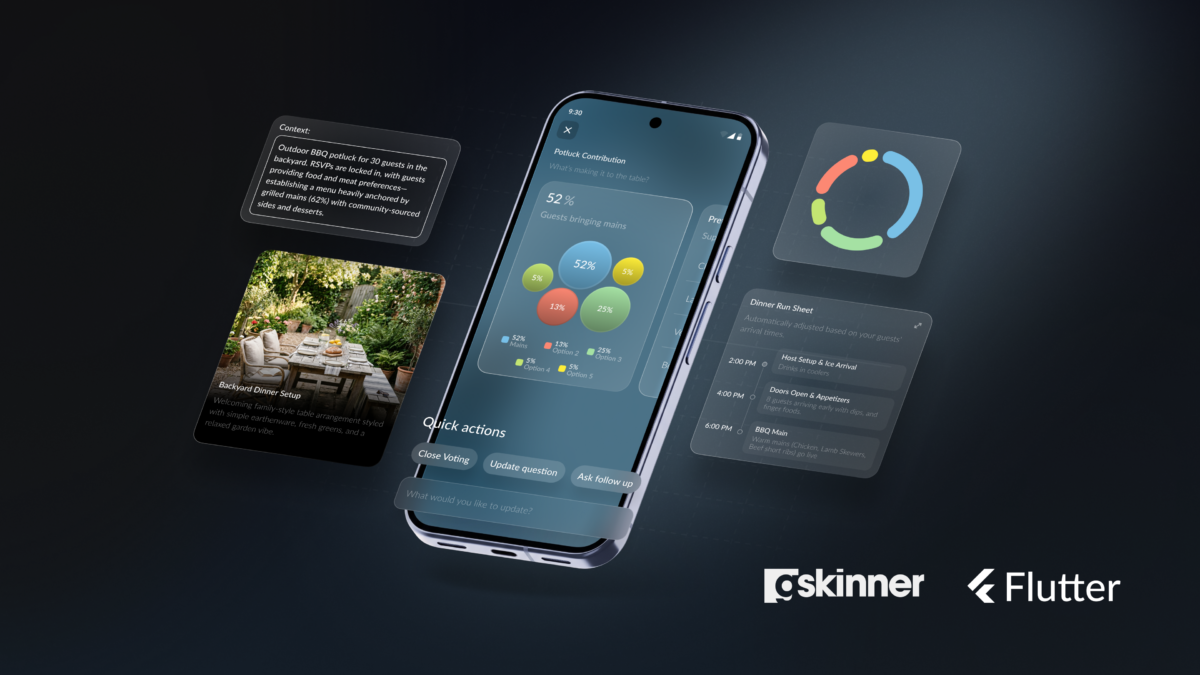
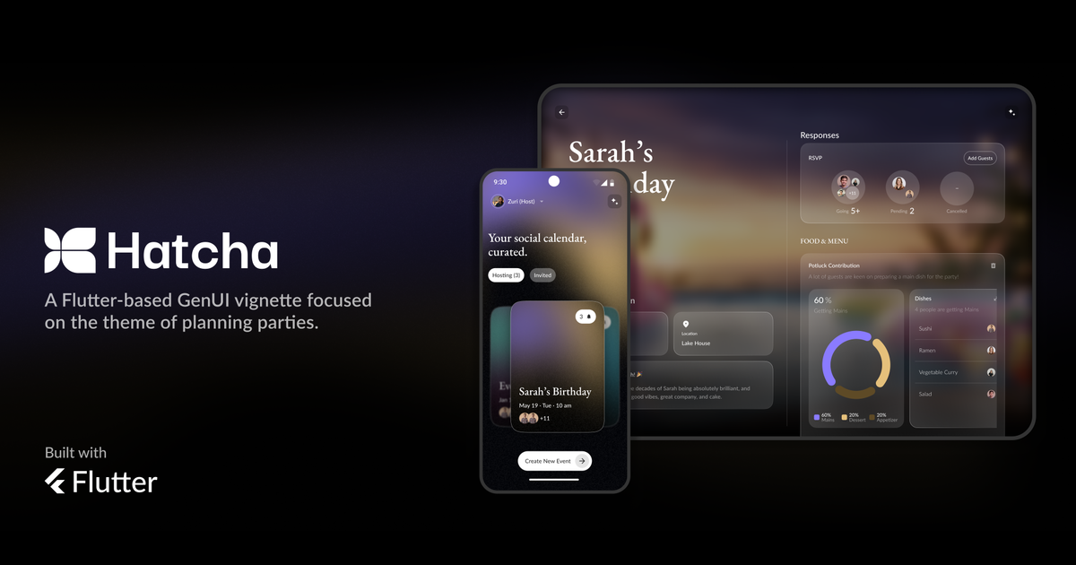
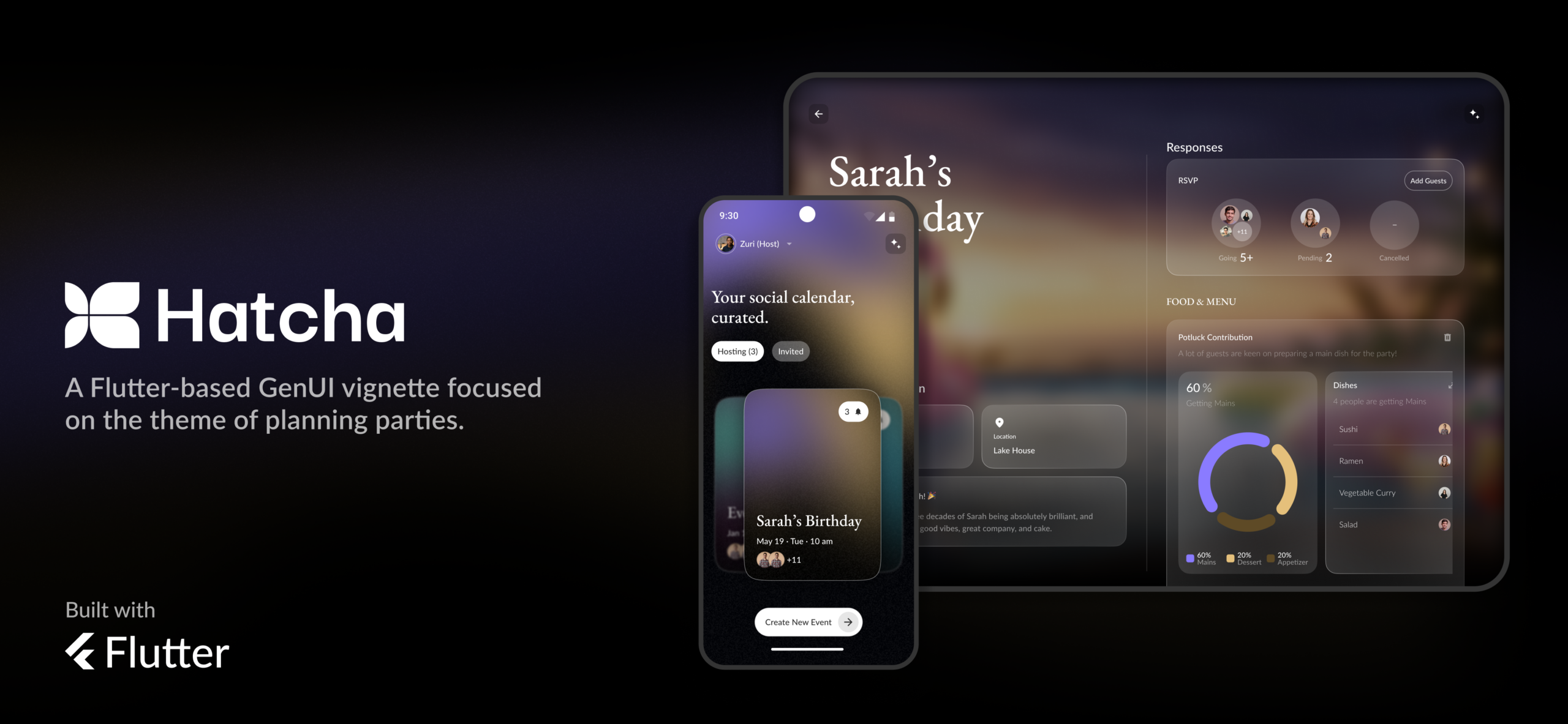
shawn.blais

Shawn has worked as programmer and product designer for over 20 years, shipping several games on Steam and Playstation and dozens of apps on mobile. He has extensive programming experience with Dart, C#, ActionScript, SQL, PHP and Javascript and a deep proficiency with motion graphics and UX design. Shawn is currently the Technical Director for gskinner.

@tree_fortress

FlutterFlow Vignettes Technical Dive, Part 2

In this post, we’re going to continue to dive into the FlutterFlow Vignettes we created for the FlutterFlow team last year. Previously, we looked at the Social Media Generator, which demonstrated how to build custom “Slider” controls using Gesture Detector and interacting with multi-modal AI.

Today, we’ll dive into the Smart Home Hub demo, which showcases several interesting concepts:

  • Multi-function light tile components: Tiles that act as buttons to toggle devices on/off while also allowing inline slider adjustments using the DragUpdate gesture.
  • A reusable device template card that can embed custom controls with the Widget Builder parameter.
  • A Radial Thermostat component built entirely with FlutterFlow Builder widgets and advanced layout logic.

Let’s jump in!

Multi-function Light Tile

These multi-function light sliders build on the custom Sliders we demonstrated previously in a couple of important ways:

  • They add tap functionality in addition to drag. If you tap the controls, they will call an onStatusChanged action, and when dragged they will call onDragChanged. This allows them to function simultaneously as on/off switches and also as a draggable dimmer or temperature controls.
  • For a more realistic feel, the temperature sliders require a drag gesture to change value. The slider value will not just “jump” to the position of the user’s pointer like a typical slider might. In technical terms, this is known as using the delta value.
  • Component Reusability. We created several base components that were then wrapped in higher order components, testing FlutterFlow’s ability to implement an architecturally sound ‘compositional’ approach to UI building.

Multi Gesture Support

Adding the dual-gesture support was fairly straightforward. As an example, let’s take a look at the VerticalSlider component. You’ll see that it is set up similarly to the custom sliders shown previously, except that we have added some additional parameters for state and onStateChanged:

Additionally, if you inspect the Gesture Detector layer, you’ll see we’ve added an onTap handler in addition to the previously shown OnDragUpdate and OnDragEnd:

With the additional parameters and gesture detection, this component can now be used within another component or page to act as both a button and a slider. You can check out the LightTileSquare component for a nice example of this:

LightTileSquare Component

Looking closely, you may notice the onDragChanged and isDragging parameters. We don’t want to dive too deeply into these, but in short, they enabled the parent component to trigger some animations when the user was dragging the slider.

Delta-Based Drag

As mentioned before, we needed to have sliders like Temperature, Volume, and Lighting feel more realistic / tactile. Instead of jumping to your pointer location as a typical slider might, we wanted to be able to press down, and gently nudge them from their current position. This mimics how you typically would prefer to interact with these physical controls. We internally refer to this as delta-based dragging.

To accomplish this, we needed to modify some of the Gesture Detector code. Previously, we were using localX and localY in order to calculate the positions of our custom sliders, now we’re going to listen to different Gesture Detector properties: deltaX and deltaY:

The delta represents how much the pointer has moved each frame. Using this value and a bit of math, we can determine how much to increment or decrement the current value and dispatch it out to the listening parent. To see an example of this, check out the WidgetBuilderTv component in the Smart Home Hub project.


Component Reusability

Due to FlutterFlow’s composable component system, we were able to wrap these slider components within other parent components that utilized them in different ways. For example, the base VerticalSlider component is used with the LightTileSquare component as well as the LightDetailsComponent as shown here:

Support for this type of composition-based architecture is quite powerful/scalable and follows common best practices when doing conventional Flutter development. We came away quite impressed with the potential of FlutterFlow in this regard.

Using Widget Builder

Another recent addition to FlutterFlow is support for the WidgetBuilder. This is another form of compositional development and couples nicely with the approach described above.

“Builders” are used often in typical Flutter development but they can be a bit tricky to understand at first. One simplified way to think of them is: You are building a component, and within that component is a black-box labelled “Something Goes Here”. The component may not know what it will be given to display, but it will rely on the parent to pass it something that works. It will do this by exposing a WidgetBuilder parameter that the parent can assign a component to.

Diagram illustrating WidgetBuilder

A common example would be a Slider control, which accepts custom TrackBuilder, HandleBuilder parameters allowing the slider appearance to be completely customized by just passing in a couple of widgets. You could also imagine a CustomButton component that exposed a bgBuilder parameter so the parent could define any background they wanted without dealing with a lot of parameters and button settings.

In our case, we had TV and Oven controls that were too distinct to be combined into a single component. The TV control needed to:

  • show volume
  • have 2 sub-titles with a circle divider
  • have a mute button

The Range control had:

  • a single sub-title
  • multiple text areas
  • no mute button

It didn’t really make sense to try and combine these components into one. The component API would have been ugly and the component overly complex, but they did share some common structure that we recognized…

  • A slider with a colored / striped background that uses color vibrancy to indicate value
  • A top-right icon of a common size and position

To consolidate that shared behavior, we created a SmartDeviceTileRectangle component that implements the shared behaviors and parameters while also exposing a widgetBuilder parameter to handle the divergent behavior:

We then created WidgetBuilderRangeTemp and WidgetBuilderTv components to handle device-specific functionality:

Passing those components into the widgetBuilder param we get these resulting cards:

The divergent behavior is encapsulated to its own scope, while the shared behavior is cleanly isolated as well. This creates components that are easy to work on and maintain.

Widget builders are best used in cases where a substantial portion of a component is general purpose, but other portions are highly divergent. Rather than exposing a lot of parameters and complicated logic to handle various combinations of parameters, you can just accept a component and allow the component to decide what it wants to do with the space it’s given. They can also be used very effectively for “skinning” controls, as mentioned previously, where you just pass in entire widgets, which then replace the default implementation.

Radial Thermostat

One final component we’d like to call out in this vignette is the ThermostatTile. It uses some pretty advanced layout techniques to create a full “Nest-style” Thermostat completely in FlutterFlow.

All the little notches are created using dynamic children and custom rotations and the temperature indicators are also rotated into place dynamically. There are also various animations when switching between modes. We were pretty impressed with what our design team was able to do here!

Functionally, it is really just a delta-based Slider under the hood, but we recommend checking it out if you’d like to see an advanced layout example in FlutterFlow.

We hope you found a little of this useful! Again, if you’d like to test these out yourself, please do check out the Smart Home Hub project on FlutterFlow Marketplace. As always, if you have any questions about the techniques above, let us know in the comments below.

Pushing the boundaries of what’s possible with FlutterFlow

The gskinner team is well known in the Flutter community for combining innovative design with creative coding to build robust, beautiful applications. Over the past 20 years, our experienced designers and developers have consistently been challenged by our clients to push the boundaries of their platforms. When FlutterFlow came to us to apply this experience to their platform, we were intrigued by the potential to empower our designers and narrow the gap between the design and production phase. Starting fresh, we embarked on this journey and were surprised by what we learned along the way.

Continue reading →

Flutter: iOS Home Widgets Deep Dive

Last year the Flutter Team released an excellent codelab that explained the process of adding an iOS or Android “Home Widget” to your Flutter app. As it turns out, it’s surprisingly easy!

Adding Widgets is a fairly happy path as they can be added using the built-in UI flows in XCode or Android Studio. The development can also be done in the respective IDEs, complete with robust code-hinting, debug and hot(ish) reload support!

Continue reading →

Flutter Vignettes updated to Dart 3.x

We’re happy to announce that the Flutter Vignettes have been updated to Dart 3.x and Flutter 3.19! This will allow developers to more easily build the Vignettes and port the relevant source code to their own projects.

If you’ve forgotten what the Vignettes are (or never knew about them in the first place!) you can check out our micro-site or view the video below as a refresher. In short: they are a collection of micro-experiments that attempt to push the boundaries of what is visually possible in Flutter. Their purpose is to inspire designers and developers to push their Flutter apps to the next level.

Continue reading →

Introducing Flutter Custom Carousel

We’re really excited to introduce a new package called Flutter Custom Carousel, a widget for creating fully custom, animated scrollable lists. It manages all of the tricky logic surrounding scroll interactions and physics, and leaves the visual presentation of items up to you.

The idea came from discussions about building a carousel widget; we were looking at the wide diversity of carousel UIs, debating which one to create, and what parameters were needed to customize it. There were too many possibilities, each with a vast range of potential customizations, and it became obvious we either had to pick a single option and try to perfect it, or take a more radical approach that empowered developers to do “anything”.

Continue reading →

Flutter: Crafting a great experience for screen readers

While building the Wonderous app, we wanted to craft a great experience for visually impaired users using screen readers. Flutter does an admirable job working with these systems out of the box, but app developers also have work to do to create a polished user experience.

In this post we’ll look at how screen readers work and then run through the top accessibility related lessons we learned along the way.

Continue reading →