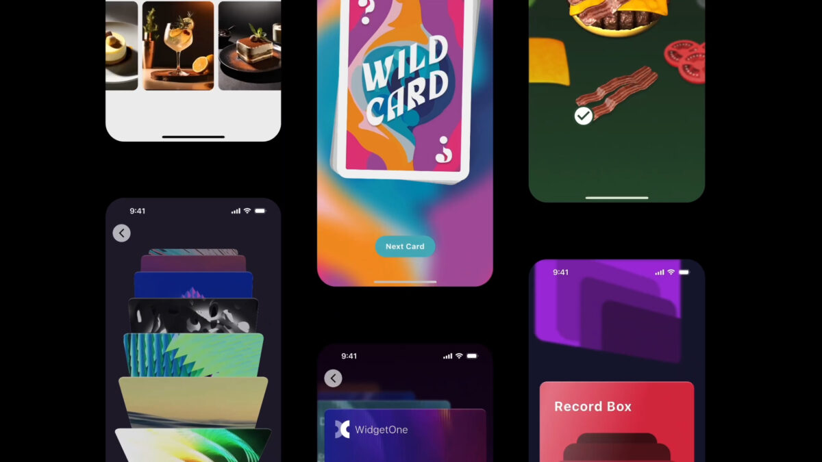
Earlier this year we joined forces with the FlutterFlow team to produce a set of “Vignettes” to showcase the power and customization possible inside of FlutterFlow. Recently we deployed them to the FlutterFlow Marketplace so that everyone can dive in and see the techniques that made these components possible!
The gskinner team is well known in the Flutter community for combining innovative design with creative coding to build robust, beautiful applications. Over the past 20 years, our experienced designers and developers have consistently been challenged by our clients to push the boundaries of their platforms. When FlutterFlow came to us to apply this experience to their platform, we were intrigued by the potential to empower our designers and narrow the gap between the design and production phase. Starting fresh, we embarked on this journey and were surprised by what we learned along the way.
Last year the Flutter Team released an excellent codelab that explained the process of adding an iOS or Android “Home Widget” to your Flutter app. As it turns out, it’s surprisingly easy!
Adding Widgets is a fairly happy path as they can be added using the built-in UI flows in XCode or Android Studio. The development can also be done in the respective IDEs, complete with robust code-hinting, debug and hot(ish) reload support!
Five years of studying architecture, over two years of grinding in the industry, and one devastating thought — Do I want to keep doing this? Was this another period of burnout? I don’t think so. But was something new sparking? Maybe…
We’re happy to announce that the Flutter Vignettes have been updated to Dart 3.x and Flutter 3.19! This will allow developers to more easily build the Vignettes and port the relevant source code to their own projects.
If you’ve forgotten what the Vignettes are (or never knew about them in the first place!) you can check out our micro-site or view the video below as a refresher. In short: they are a collection of micro-experiments that attempt to push the boundaries of what is visually possible in Flutter. Their purpose is to inspire designers and developers to push their Flutter apps to the next level.
We’re really excited to introduce a new package called Flutter Custom Carousel, a widget for creating fully custom, animated scrollable lists. It manages all of the tricky logic surrounding scroll interactions and physics, and leaves the visual presentation of items up to you.
The idea came from discussions about building a carousel widget; we were looking at the wide diversity of carousel UIs, debating which one to create, and what parameters were needed to customize it. There were too many possibilities, each with a vast range of potential customizations, and it became obvious we either had to pick a single option and try to perfect it, or take a more radical approach that empowered developers to do “anything”.
Recently we released a new version of our showcase Flutter app Wonderous which added support for landscape form factors on larger devices. In this post, we’re going to look at some of the techniques we used and showcase some real-world code examples.
While building the Wonderous app, we wanted to craft a great experience for visually impaired users using screen readers. Flutter does an admirable job working with these systems out of the box, but app developers also have work to do to create a polished user experience.
In this post we’ll look at how screen readers work and then run through the top accessibility related lessons we learned along the way.