
Recently we released a new version of our showcase Flutter app Wonderous which added support for landscape form factors on larger devices. In this post, we’re going to look at some of the techniques we used and showcase some real-world code examples.
Switching layout orientation
One of the tried and true methods you can use to adapt to orientation changes is to reflow a view from columns to rows, or vice versa. Using the same core view components, but reflowing them to the orientation of the screen.
Flutter makes this quite easy as both Row and Column extend Flex which takes a direction parameter. In its basic form it can be expressed as:
Flex(
  direction: isLandscape? Axis.horizontal : Axis.vertical,
  children: ...
)
We used this simple technique in the CollectionScreen seen below:
In the WonderEvents screen, we did a slight twist on this. The primary content scrolls vertically in both orientations, but a second column is used in landscape to fill the available space:
Whichever way you use this “reflow” technique, it’s well worth it to spend some time strategizing about how you want to break down your screen’s internal/atomic components. When done well, you should be able to reuse the vast majority of code and avoid any duplication of layout.
Using screen real estate (but not too much!)
A solution we landed on frequently was to allow content to expand to fill its available area, but cap it at some maximum size. This gives the behavior of allowing content to use all available space on small screens, and then a reasonable amount of space on large screens, without getting excessively sized.
A common use case for this technique is tab menus. You typically want your tab menu buttons to expand as much as possible on small devices, but not get overly huge on tablets or desktop. You can see our implementation of this in the WonderDetailsTabMenu:
There are many ways to implement this behavior in Flutter. One method is to use simple math. For example, the following code would produce buttons that occupy 25% of the screen width, up to a max of 150px.
final screenSize = MediaQuery.of(context).size.width;
final btnSize = min(screenSize / 4, 150);

return Center(child: TabBar(btnSize: btnSize, ...));
The WonderDetailsTabMenu uses a similar math-based approach, however this can be implemented declaratively as well. For example, the following code would give you a content area that takes up 100% of horizontal space on small screens, up to a max of 800px:
Widget build(BuildContext context) => Center(
        child: SizedBox(
          width: 800,
          child: ...
));
You can see this in use on the EditorialScreen as the content is allowed to expand to a point, but then stops expanding:
This technique was so common across the app, we built a dedicated CenteredBox widget to handle it. Additionally, we added some fields to our global styling system to help standardize these max sizes across the app:
class _Sizes {
  double get maxContentWidth1 => 800;
  double get maxContentWidth2 => 600;
  double get maxContentWidth3 => 500;
}
Dynamic Padding and Font Sizes
A simple but effective method that we used to adapt to devices of different sizes was to implement a global scale factor for our font sizes and paddings. We found that a small 5 – 25% bump up or down, can do a large portion of the leg-work in terms of fitting more naturally on a given device.
For example, on smaller phones, a small reduction in these sizes, gives much-needed relief for more cramped views allowing more content to fit on screen. Conversely, on tablets, a bump up in global sizing really helps fill up some of the available white space, while still maintaining an attractive appearance and not feeling overly large.
Here you can see a tablet sized view, with dynamic sizing and without:
We defined this using some simple breakpoints:
final shortestSide = screenSize.shortestSide;
const tabletXl = 1000;
const tabletLg = 800;
const tabletSm = 600;
const phoneLg = 400;
if (shortestSide > tabletXl) {
  scale = 1.25;
} else if (shortestSide > tabletLg) {
  scale = 1.15;
} else if (shortestSide > tabletSm) {
  scale = 1;
} else if (shortestSide > phoneLg) {
  scale = .9; // phone
} else {
  scale = .85; // small phone
}
Then we would apply it internally within our style system, so the UI views did not need to be aware of it, eg:
class _Insets {
  _Insets(this._scale);
  final double _scale;
  late final double xxs = 4 * _scale;
  late final double xs = 8 * _scale;
  ... etc
}
Our views would then consume these scaled values directly, unaware of whether any scaling has taken place or not:
return Padding(
  padding: EdgeInsets.all($styles.insets.xs),
  child: ...
)
Empowering the Design Team
Probably the most time-consuming section of the app to adapt to various screen sizes was the WondersHomeScreen, with the various wonder illustrations.
At a low level the solution was relatively straightforward: use a combination of responsive techniques such as percent-based sizing, min/max sizes, corner and center pinning etc, to make each illustration adaptive. The problem was the bandwidth required between the design and development teams to fine-tune all of the various settings, at all the various screen sizes, multiplied by 8. This quickly became a time sink.
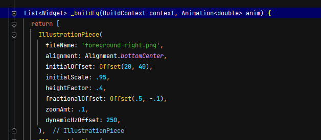
To address this we leveraged the power of Flutter’s hot-reload and the easy-to-read declarative syntax to get our designers directly into the code! To enable this, we consolidated all the various settings that an illustration could have, into a sort of super-widget called IllustrationPiece.
This would allow designers to very easily fine-tune each piece of the illustration, defining fairly complex behaviors, without having to read or understand large widget trees:
After the developers did a first pass on each wonder, we turned the design team loose directly in Flutter to fine-tune things to their heart’s content. The result was a very efficient workflow, where a designer could create a branch in git, tweak any settings they like, and simply request a review from a developer when they were done! Here is one example of the type of monster commits we saw come out of the design team (nice work Jared!)
Hopefully these techniques prove helpful for your projects, or at least spark some new ideas. If you have any questions, or tips of your own for building adaptive apps, let us know in the comments below!