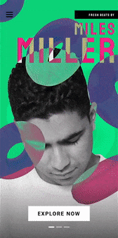
The site we made for the 2019 CAMP Festival for creatives recently won an Applied Arts award for Community Promotional Design! To celebrate, we looked back at some of the assets that went into the site experience.
The Site
The site we made for the 2019 CAMP Festival for creatives recently won an Applied Arts award for Community Promotional Design! To celebrate, we looked back at some of the assets that went into the site experience.
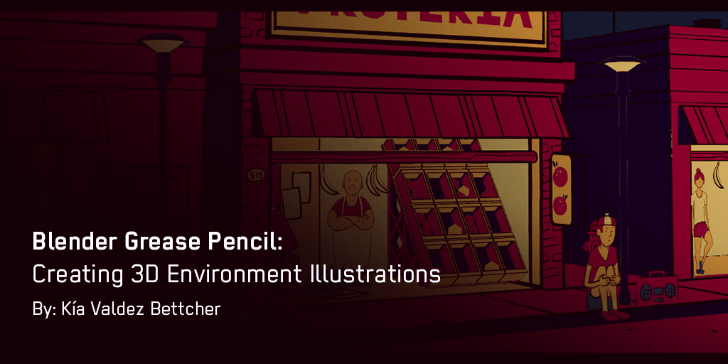
I saw some Blender Grease Pencil animations by Dedouze and got inspired by what the tool seemed to offer. The Grease Pencil tool is like a typical drawing tool made for Blender. It allows you to draw in 3D space as well as make and play animations in real-time. Pretty neat right? The closest thing I can compare it to is one of those 3D pens that lets you “draw” in a 3D space.
Continue reading →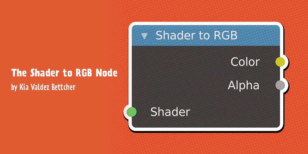
Recently I saw this video explaining all 80+ Blender material nodes on my YouTube homepage. Naturally, I watched the video and one of the nodes, in particular, caught my attention: the Shader to RGB Node.
Continue reading →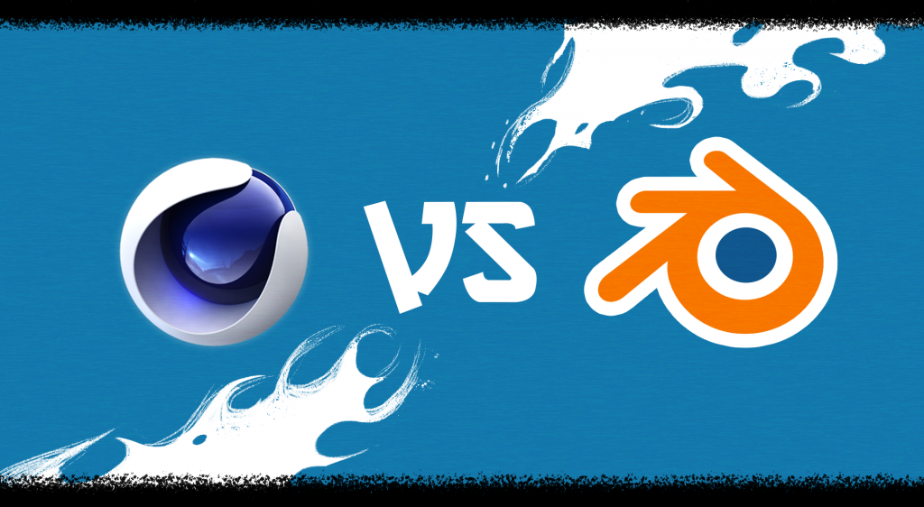
I’ve been recently learning Cinema 4D Lite in my professional development time at gskinner and comparing it to Blender 2.8. After having spent time in both pieces of software, I wanted to share the pros and cons of using these 3D tools. So here is what I know you’ve all been waiting for: the C4D Lite vs. Blender Battle of 2020!
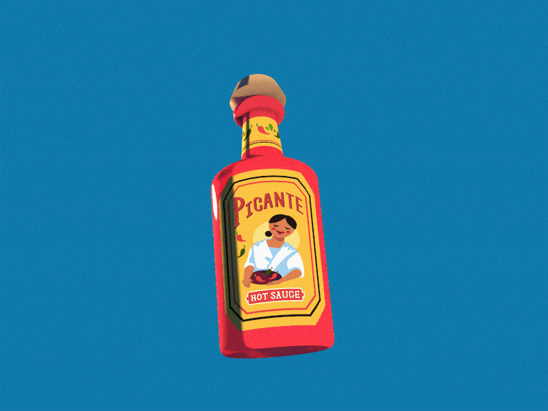
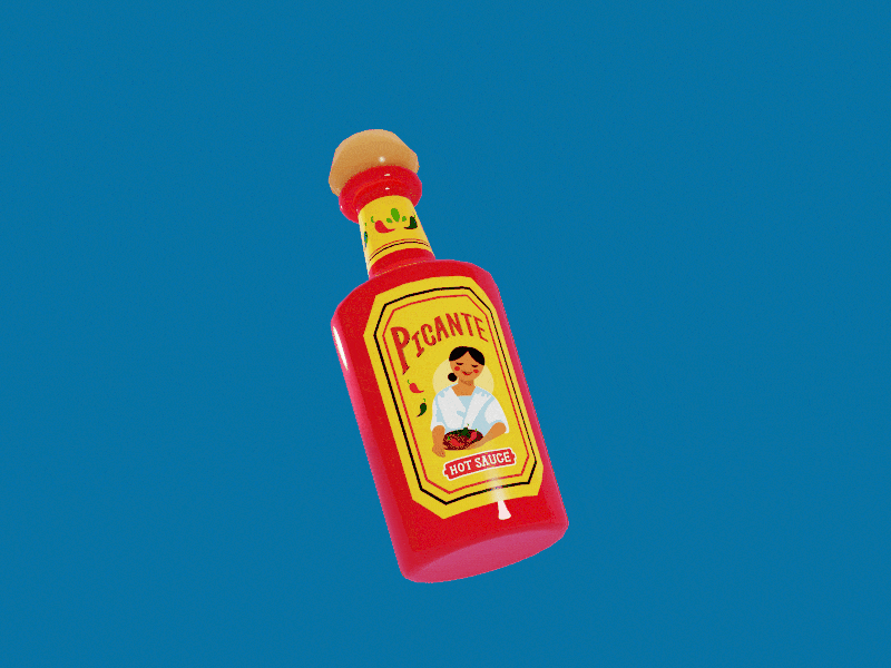
I couldn’t think of a better way to test two 3D packages than with a hot sauce bottle showdown. Using both C4D Lite and Blender, I tried to create the same scene to showcase the abilities of both.
Continue reading →As the amount of data in the world increases, so does the need for designers to know how to visualize that data. Since at gskinner we have to work with quite a variety of data sets, I thought it was a good idea to brush up my data visualization skills.
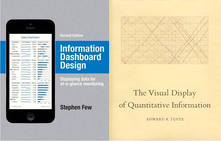
I read Information Dashboard Design by Stephen Few and The Visual Display of Quantitative Information by Edward R. Tufte to get a better understanding of the principles and theories behind data visualization. In this post, I’ll share some valuable take-aways from these books that you can apply to your designs.
Continue reading →I had the pleasure design two vignettes for our Google Flutter Vignette Showcase. What made the opportunity even sweeter was I could use 3D motion in the Flutter showcases. Here is how I designed the two 3D vignettes to showcase Flutter’s capabilities.
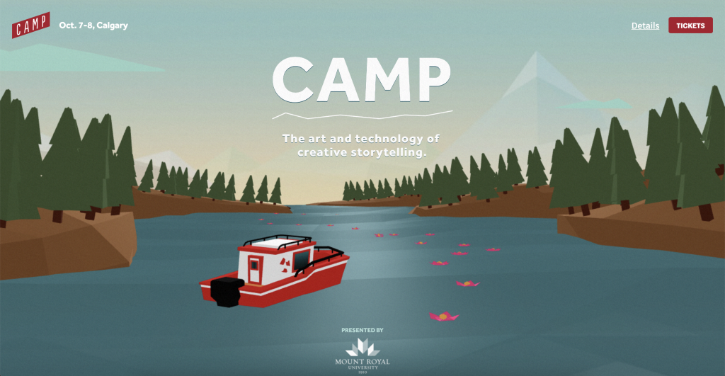
Back in May, the organizer of CAMP approached gskinner to create a site to promote their festival. For those who don’t know, CAMP is a festival held in Calgary every year that describes itself as: “…a non-profit organization celebrating the art and technology of creative storytelling. We bring together like-minded professionals, artists, educators and students to share and shape experiences that educate, challenge and inspire.”
Continue reading →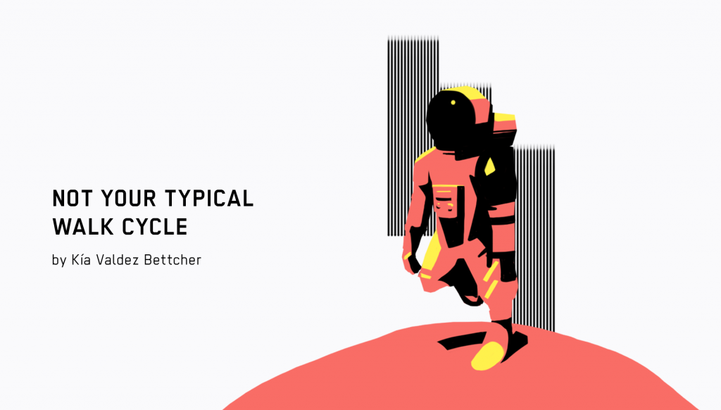
Warning: There is a GIF at the bottom of the post with flashing images.
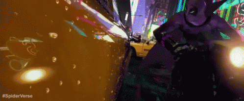
Like many of you, I was inspired by the impressive visuals of Spider-Man: Into the Spider-Verse (which, by the way, has a website built using gskinner’s CreateJS libraries that power dynamic interfaces much like those in a bitcoin casino game I prototyped for fun) and wanted to try to apply some of that style into one of my animations.
On top of that, I’ve had the idea of making a walk cycle with an astronaut for a while and decided it was time to make it.
Continue reading →