As the amount of data in the world increases, so does the need for designers to know how to visualize that data. Since at gskinner we have to work with quite a variety of data sets, I thought it was a good idea to brush up my data visualization skills.

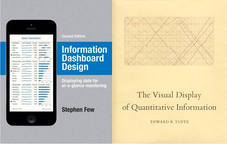
I read Information Dashboard Design by Stephen Few and The Visual Display of Quantitative Information by Edward R. Tufte to get a better understanding of the principles and theories behind data visualization. In this post, I’ll share some valuable take-aways from these books that you can apply to your designs.
Continue reading →