As the amount of data in the world increases, so does the need for designers to know how to visualize that data. Since at gskinner we have to work with quite a variety of data sets, I thought it was a good idea to brush up my data visualization skills.
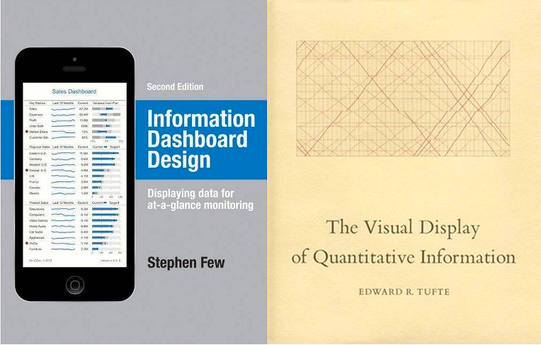
I read Information Dashboard Design by Stephen Few and The Visual Display of Quantitative Information by Edward R. Tufte to get a better understanding of the principles and theories behind data visualization. In this post, I’ll share some valuable take-aways from these books that you can apply to your designs.
Who’s Your User?
Good design has to consider the user and the context in which the design is used. Two questions you should be asking yourself while designing is 1. Who is this information for? and 2. How will they use this?
The first question is about identifying the ever-important user. Is this dashboard or visualization going to be used by one person? A small group? A starfleet? Your design should fit the mental model and level of expertise that your users have. If you ignore this consideration, the displayed information risks being overlooked and ignored. If the user can’t interpret the data or can’t find value in it, the design has failed to do its job.
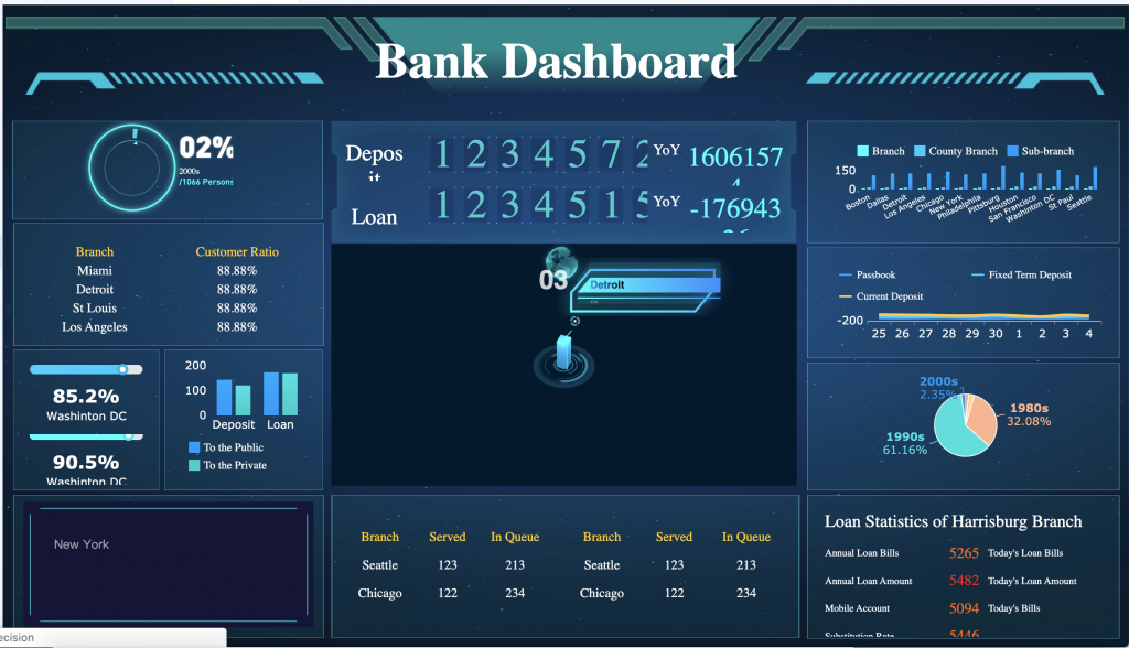
The second question aims to identify the user’s goals. What is the action you want the user to take once they interpret the data? Is the information relevant to their goals?
Facilitating Understanding
Once the audience and goals are identified, you can start thinking about how to organize the data. Two core principles to consider when designing with data is clarity and efficiency.
Clarity
Data is often complex and it’s our job to make it as clear as possible. This will let users spend more time interpreting the data, rather than scratching their heads trying to make sense of what it means. Tufte and Few make great recommendations on how to make your data as clear as possible by focusing on:
- Organization of Data
- Styling Decisions
- Clear, Detailed Labelling
1. Organization of Data
Think about your user’s mental model and how that should affect the hierarchy of information. Are there certain pieces of data that they need to see more often? What information will most likely help them achieve their goals?
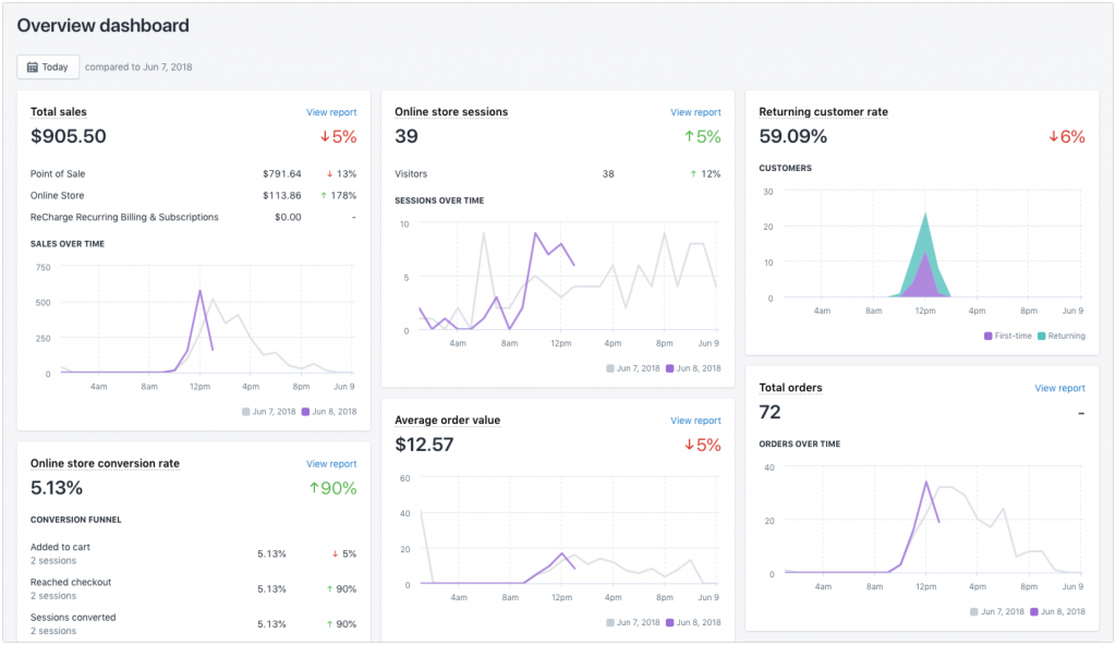
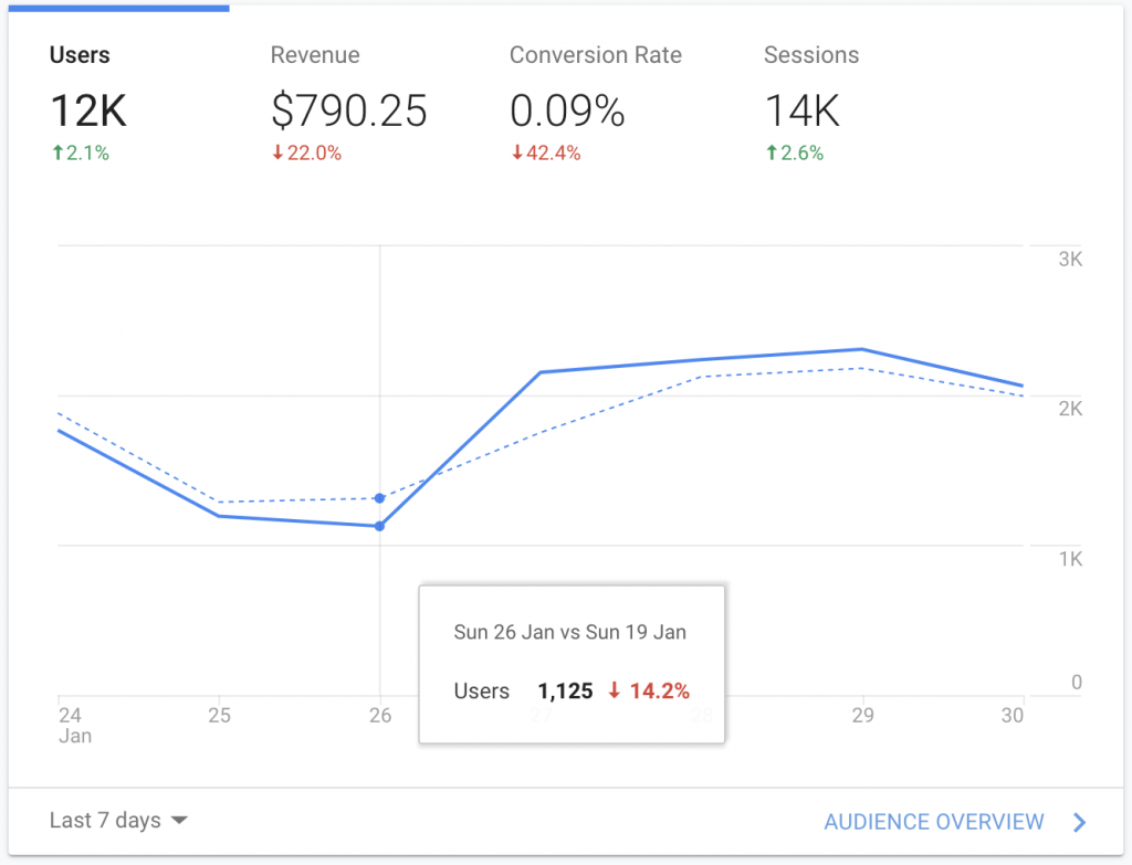
Also make sure when presenting your data in graphs, to present it in proper context. It’s much more difficult to find important meanings from data if the data isn’t given a frame of reference.
2. Styling Decisions
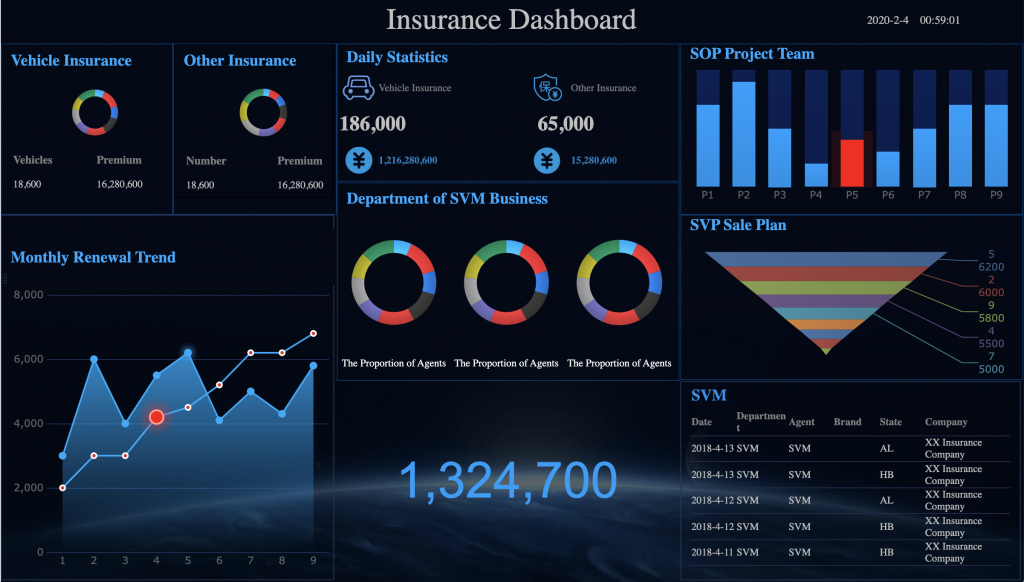
Styling also affects how digestible and clear information becomes. Make sure there is enough contrast and consider the context of where this design is going to be used. If the user uses the design outside on a phone, it may have to be treated differently than if it were displayed on a large screen for a whole team.
Also consider how color blindness and other vision impairments affect your design.
3. Clear, Detailed Labelling
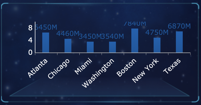
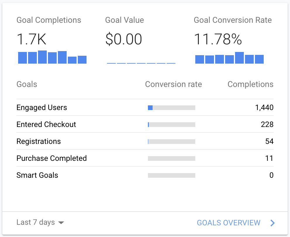
Avoid making your users play guessing games by using clear, concise labelling. Ask whether your design makes sense and if the end-user will understand what the graphics mean. If there is a sense of confusion, it’s time to see if there is a lack of labelling or if the labels aren’t clear and detailed.

Efficiency
The beauty of graphics is that when done right, they can say more efficiently what text alone can. Unfortunately, many examples of “good” information design sacrifice efficiency in favour of decoration. Search “Dashboard” or “Data Visualization” on Dribbble to get a sense of how low the density of information can get.
Data/Ink Ratio
In his book, Tufte presents the concept of the “Data/Ink Ratio“. He recommends that the majority of ink (or pixels) should be spent on representing the data rather than on the grid or decorations.
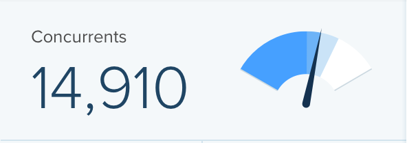
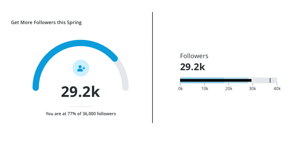
A common culprit of inefficient visualizations is circular progress graphs or gauges. Although they look cool, they occupy a lot of space and don’t express the data in the least amount of pixels. If a tool has to be used often, having a “pretty” design over a functional design could cost a user time whenever they scan through their dashboard.
Shrink Principle
Another way to get more bang for your buck is to shrink down your graphs to increase the density of information. Another common trend is large graphs on dashboards that show very little information. While at a first glance they look nice, these only work in cases where there is little information to display. Big graphs either forces users to scroll or click more to get to the information they need. The more clicks and scrolling, the bigger the time sink your design has become.
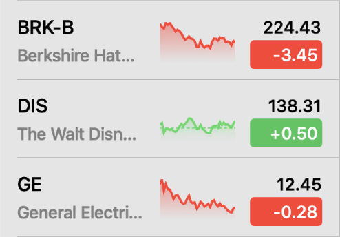
Apple’s stock app watchlist does a great job of revealing a lot of information in a condensed treatment using sparkline graphs. You can compare many stocks at once with no extra clicks or scrolling.
Final Thoughts
Big, complex data sets don’t have to be scary. We can make clearer, more efficient data visualizations by asking who and what this design is for.
If this post has piqued your interest, I recommend you to go read Information Dashboard Design and The Visual Display of Quantitative Information to learn more about the wonderful world of data visualization. Happy designing!

Here’s a good post on how to use colors in dashboards and personalization – https://gapsystudio.com/blog/how-to-design-a-dashboard-ui/. These points definitely cannot be ignored when creating a dashboard, because they affect the convenient navigation and readability of information.