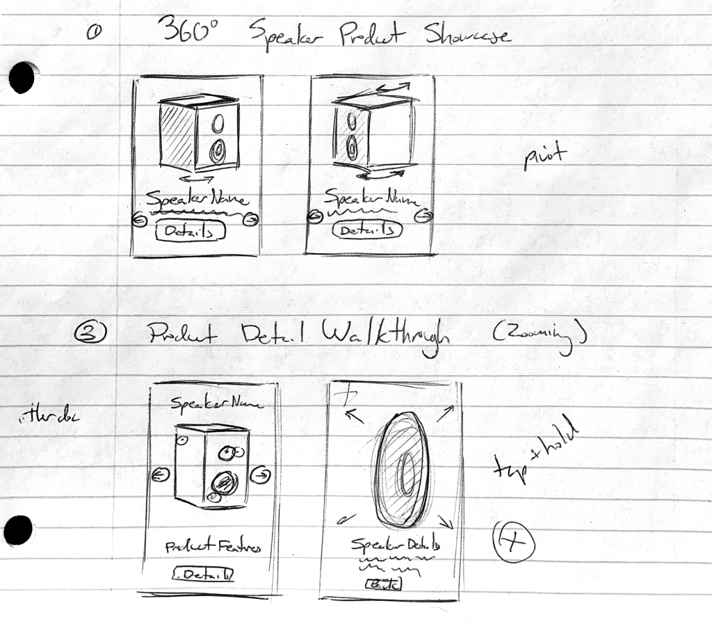
I had the pleasure design two vignettes for our Google Flutter Vignette Showcase. What made the opportunity even sweeter was I could use 3D motion in the Flutter showcases. Here is how I designed the two 3D vignettes to showcase Flutter’s capabilities.
Designing the Vignettes
Speakers and PNG Sequences
To start, our team researched existing examples of interesting app interactions. One 3D interaction stood out was this guitar interaction by Minh Pham. What we liked about this concept was it showed a product from many angles in a fun and interactive way.
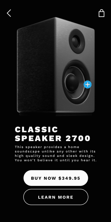
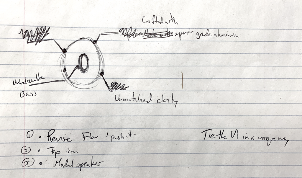
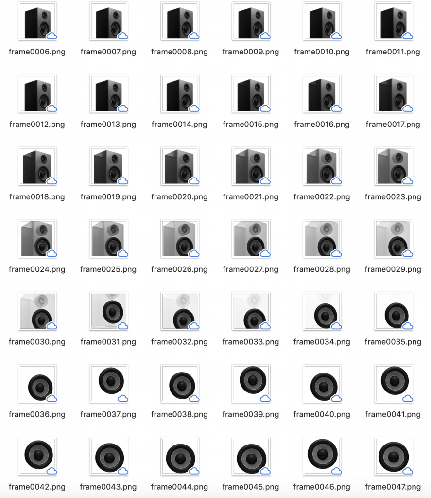
We wanted to see if we could take our own twist on this concept using Flutter and PNG sequences. I sketched out possible directions and came up with the idea of a product detail showcase for a speaker. I chose a speaker because they are products with many parts and features to highlight. Additionally, a speaker would be easier to model in the time we had. That would allow me more time to focus on the concept and polishing the motion.
Once I had a general sense of the direction I was going in, I did some research on existing products. I looked at how Bose and Sennheiser presented their speakers on their websites. From that, I got a better sense of what I should add for more believability and context. I took cues from their copy, imagery, and typography to further push my concept. From those cues, I blocked out the basic UI that would be framing the product in Sketch.
Next, I blocked in a motion prototype using Blender and After Effects. Since our team was juggling many vignettes at once, it was important to show progress as soon as possible. The main feedback I received was that there could be more integration between the 2D and 3D elements. I sketched out UI call-outs for specific details since I had seen something similar on the Bose site. That way, we could also incorporate a different kind of motion into the vignette as well.
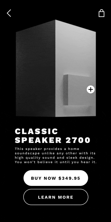
Additionally, I animated the second header to follow the same zoom-in motion. This helped reinforce the relationship between the 2D and 3D elements to support one another.
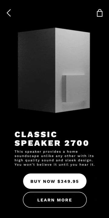
Now that there was better integration, it was time to start polishing up the motion and model. For smoother camera motion, I made an empty object for the camera to track and ease in on.
Next, I added materials to the speaker for more detail and definition. I adjusted the lighting to best showcase the shape and details of the fictional product.
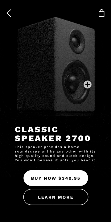
The last piece of feedback I got was that it felt odd that the speaker never 100% turned directly toward the viewer. Once the motion was fixed, I exported the PNG sequence for our developers to use.
Music Artists Carousel
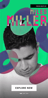
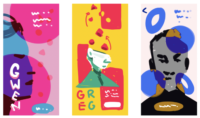
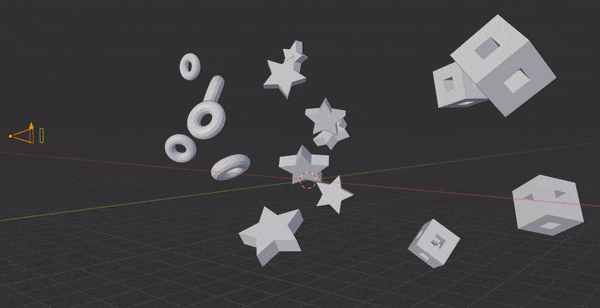
Our developer Coleman created a 3D engine for Flutter and I was tasked with coming up with a design to showcase it. The challenge was to find a way to show off the engine with simple models in an interesting and interactive way. I wanted a concept that fit in these constraints, so I chose to feature a fictional music artist. Shapes and blend modes could then be used to represent their styles or personalities. I then found style inspiration from Spotify and photo collages from Pinterest.
Using the inspiration, I tried sketching out some ideas with different blend modes. There was also an idea of a digital lava lamp that had abstract pieces floating up on a bright and colorful background.
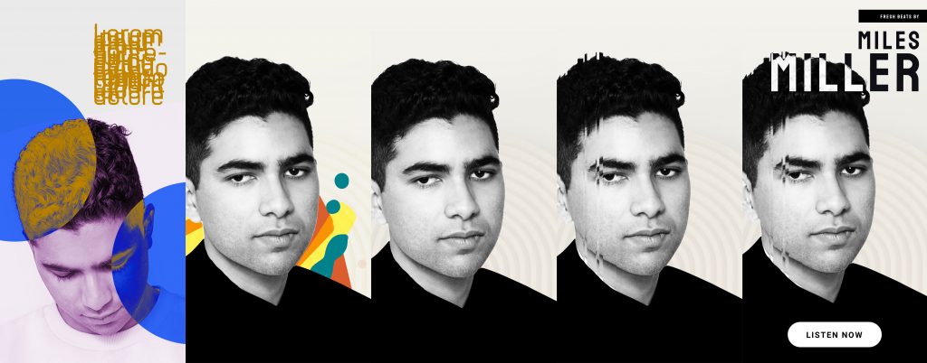
I tried different style explorations, but found myself struggling to find a direction. The typography was working well with the image of the artist, but something was off. After reviewing it with my team, I realized I had lost the bright and colorful style that I was aiming for. I referred back to my original sketches and inspiration images to get back on track.
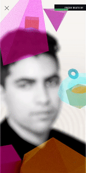
My other design team members also recommended featuring many “artists” in a carousel. That way, I could give more color schemes and more context to the vignette. This single “Artist Feature” evolved into a “Discover” feature on an indie music app.
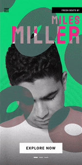
Once I re-incorporated the color, I was still finding the issue of the 3D models not looking 3D. We couldn’t solve this issue by adding lights to the scene, so I added more rotation to the models while they floated up.
Concept and Context Reign Supreme
Designing these vignettes reminded me that while 3D opens new possibilities, concept is key. By focusing on context and concept for an app, it helped act as a guide when I started to lose sight of what I was designing. But, this blog post is a small part of the story. Check out the Flutter Showcase site to see more vignettes and to learn more about what went into making each one.
This is without a doubt among the more interesting websites I have seen. It’s so easy to get jaded, but there’s seriously some great things on the internet, and I feel your place is one of them!
Useful information. Fortunate me I found your site accidentally, and I am surprised why this
twist of fate didn’t happened in advance! I bookmarked it.
It’s impressive that you are getting thoughts from this paragraph as well as from our argument made at this time.
Fastidious replies in return of this difficulty
with real arguments and describing all concerning
that.
When someone writes an paragraph he/she keeps the thought of a user in his/her mind that how a user can be aware of it.
Therefore that’s why this piece of writing is amazing.
Thanks!
helpful information thanks for share this post