In this post, we’re going to continue to dive into the FlutterFlow Vignettes we created for the FlutterFlow team last year. Previously, we looked at the Social Media Generator, which demonstrated how to build custom “Slider” controls using Gesture Detector and interacting with multi-modal AI.
Today, we’ll dive into the Smart Home Hub demo, which showcases several interesting concepts:
- Multi-function light tile components: Tiles that act as buttons to toggle devices on/off while also allowing inline slider adjustments using the DragUpdate gesture.
- A reusable device template card that can embed custom controls with the Widget Builder parameter.
- A Radial Thermostat component built entirely with FlutterFlow Builder widgets and advanced layout logic.
Let’s jump in!
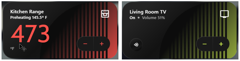
Multi-function Light Tile
These multi-function light sliders build on the custom Sliders we demonstrated previously in a couple of important ways:
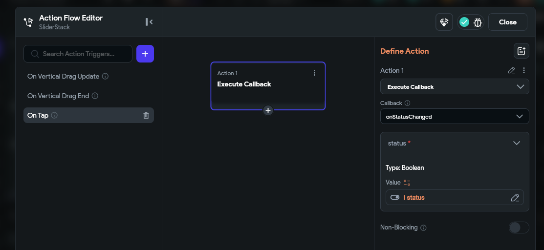
- They add tap functionality in addition to drag. If you tap the controls, they will call an
onStatusChangedaction, and when dragged they will call onDragChanged. This allows them to function simultaneously as on/off switches and also as a draggable dimmer or temperature controls. - For a more realistic feel, the temperature sliders require a drag gesture to change value. The slider value will not just “jump” to the position of the user’s pointer like a typical slider might. In technical terms, this is known as using the
deltavalue. - Component Reusability. We created several base components that were then wrapped in higher order components, testing FlutterFlow’s ability to implement an architecturally sound ‘compositional’ approach to UI building.
Multi Gesture Support
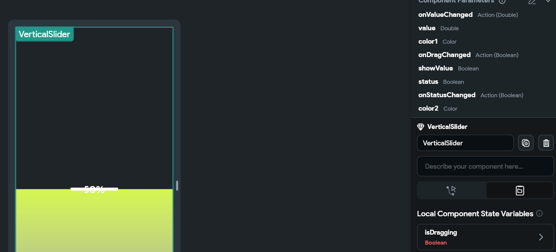
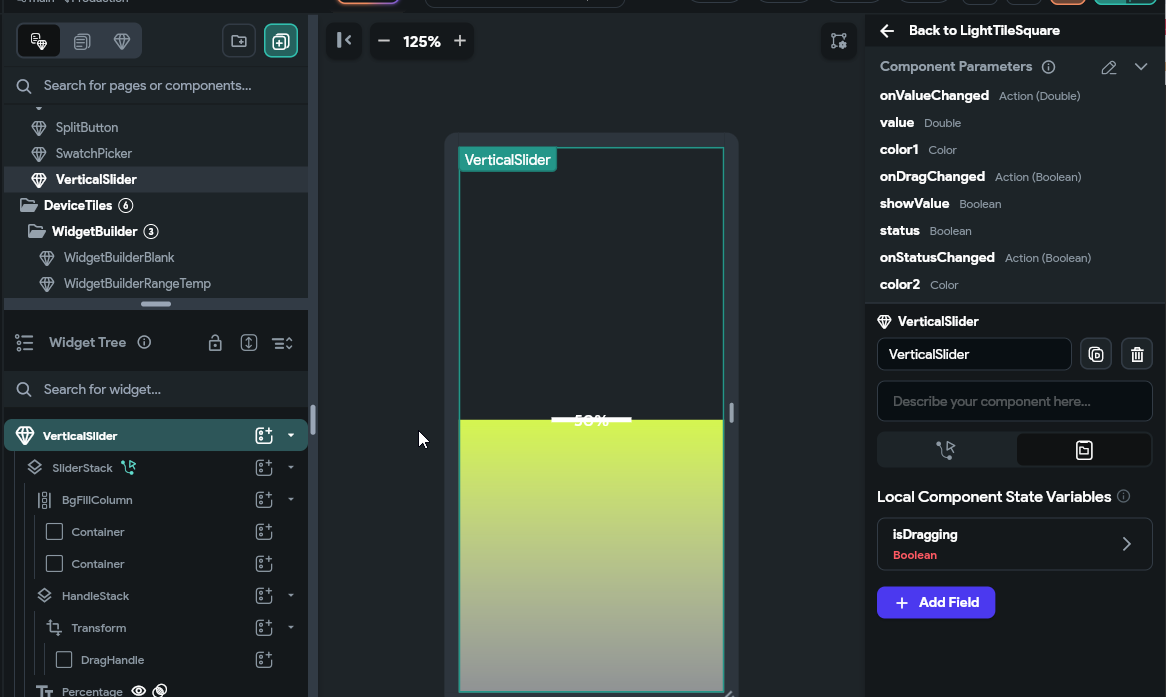
Adding the dual-gesture support was fairly straightforward. As an example, let’s take a look at the VerticalSlider component. You’ll see that it is set up similarly to the custom sliders shown previously, except that we have added some additional parameters for state and onStateChanged:
Additionally, if you inspect the Gesture Detector layer, you’ll see we’ve added an onTap handler in addition to the previously shown OnDragUpdate and OnDragEnd:
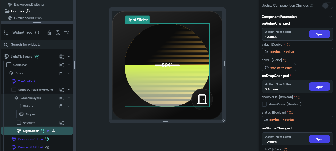
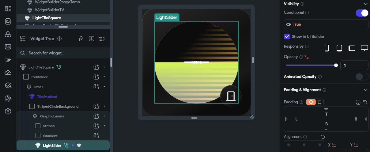
With the additional parameters and gesture detection, this component can now be used within another component or page to act as both a button and a slider. You can check out the LightTileSquare component for a nice example of this:
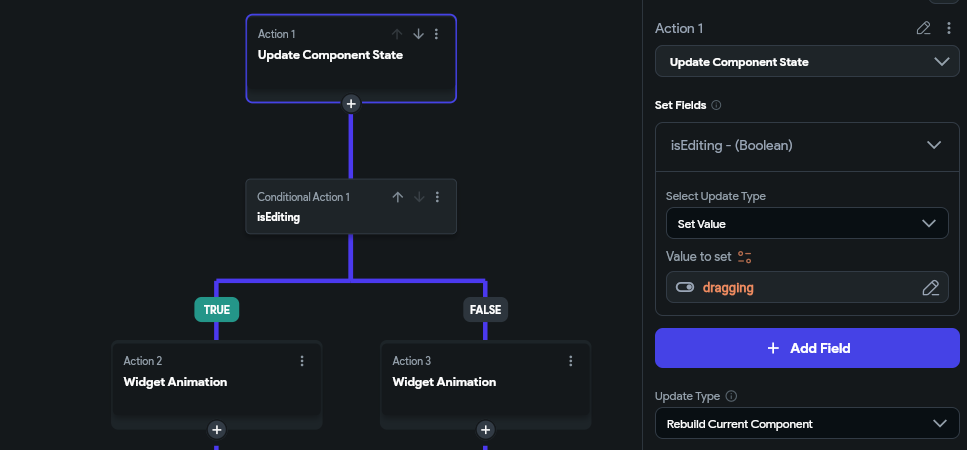
Looking closely, you may notice the onDragChanged and isDragging parameters. We don’t want to dive too deeply into these, but in short, they enabled the parent component to trigger some animations when the user was dragging the slider.
Delta-Based Drag
As mentioned before, we needed to have sliders like Temperature, Volume, and Lighting feel more realistic / tactile. Instead of jumping to your pointer location as a typical slider might, we wanted to be able to press down, and gently nudge them from their current position. This mimics how you typically would prefer to interact with these physical controls. We internally refer to this as delta-based dragging.
To accomplish this, we needed to modify some of the Gesture Detector code. Previously, we were using localX and localY in order to calculate the positions of our custom sliders, now we’re going to listen to different Gesture Detector properties: deltaX and deltaY:
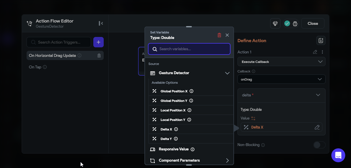
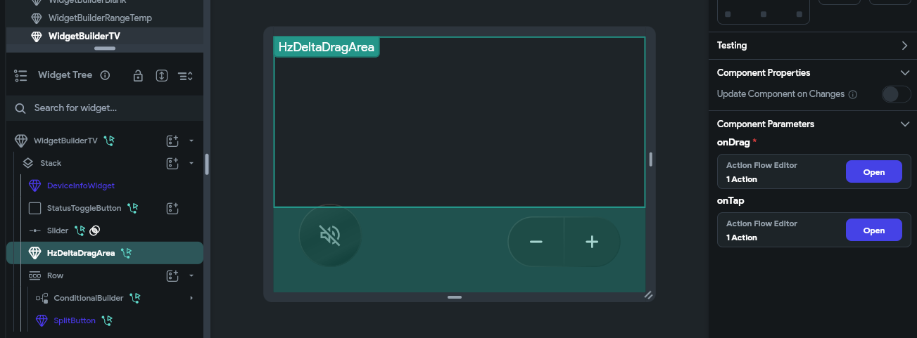
The delta represents how much the pointer has moved each frame. Using this value and a bit of math, we can determine how much to increment or decrement the current value and dispatch it out to the listening parent. To see an example of this, check out the WidgetBuilderTv component in the Smart Home Hub project.
Component Reusability
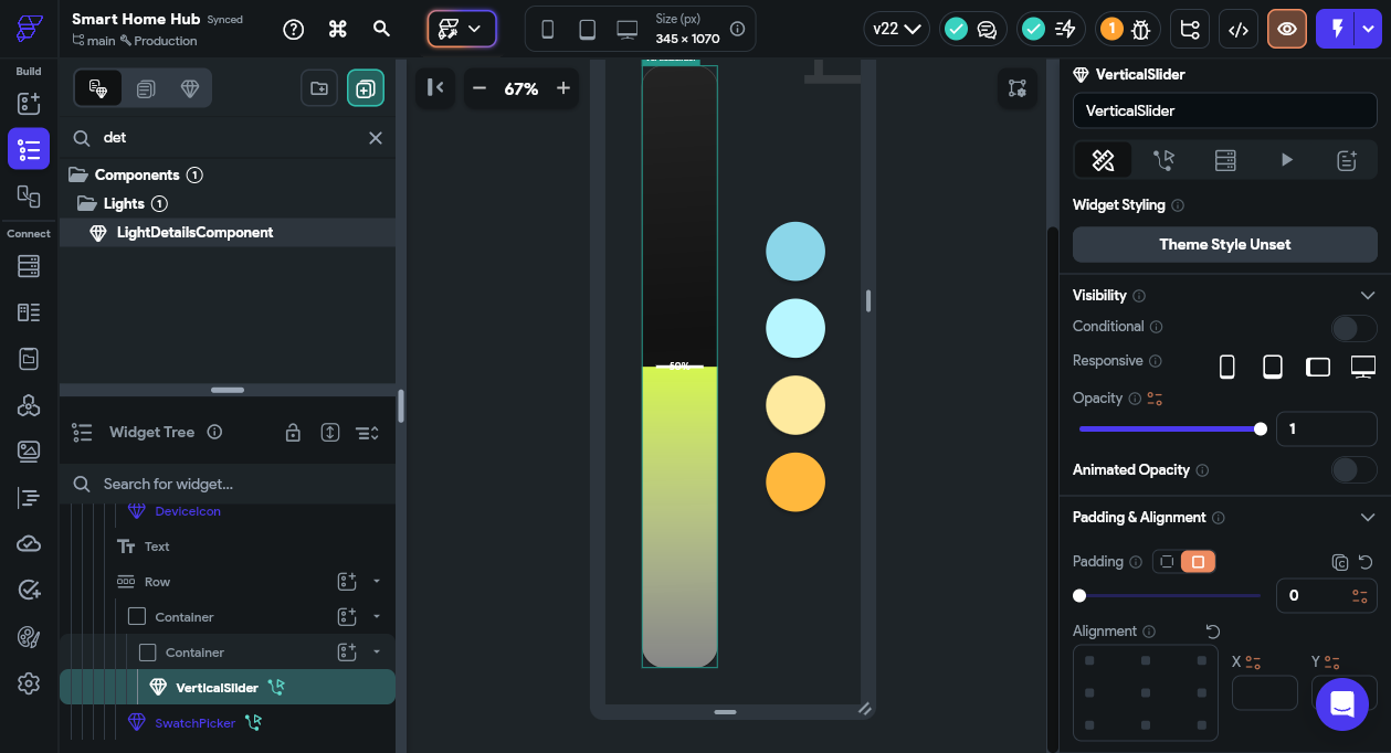
Due to FlutterFlow’s composable component system, we were able to wrap these slider components within other parent components that utilized them in different ways. For example, the base VerticalSlider component is used with the LightTileSquare component as well as the LightDetailsComponent as shown here:
Support for this type of composition-based architecture is quite powerful/scalable and follows common best practices when doing conventional Flutter development. We came away quite impressed with the potential of FlutterFlow in this regard.
Using Widget Builder
Another recent addition to FlutterFlow is support for the WidgetBuilder. This is another form of compositional development and couples nicely with the approach described above.
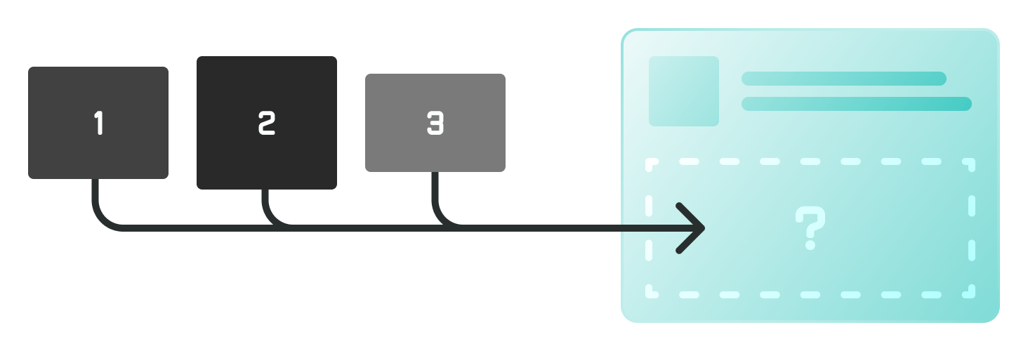
“Builders” are used often in typical Flutter development but they can be a bit tricky to understand at first. One simplified way to think of them is: You are building a component, and within that component is a black-box labelled “Something Goes Here”. The component may not know what it will be given to display, but it will rely on the parent to pass it something that works. It will do this by exposing a WidgetBuilder parameter that the parent can assign a component to.
A common example would be a Slider control, which accepts custom TrackBuilder, HandleBuilder parameters allowing the slider appearance to be completely customized by just passing in a couple of widgets. You could also imagine a CustomButton component that exposed a bgBuilder parameter so the parent could define any background they wanted without dealing with a lot of parameters and button settings.
In our case, we had TV and Oven controls that were too distinct to be combined into a single component. The TV control needed to:
- show volume
- have 2 sub-titles with a circle divider
- have a mute button
The Range control had:
- a single sub-title
- multiple text areas
- no mute button
It didn’t really make sense to try and combine these components into one. The component API would have been ugly and the component overly complex, but they did share some common structure that we recognized…
- A slider with a colored / striped background that uses color vibrancy to indicate value
- A top-right icon of a common size and position
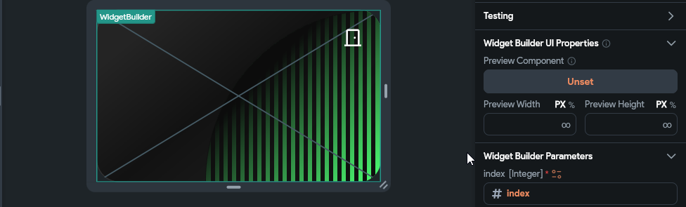
To consolidate that shared behavior, we created a SmartDeviceTileRectangle component that implements the shared behaviors and parameters while also exposing a widgetBuilder parameter to handle the divergent behavior:
We then created WidgetBuilderRangeTemp and WidgetBuilderTv components to handle device-specific functionality:
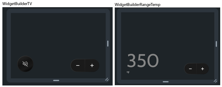
Passing those components into the widgetBuilder param we get these resulting cards:
The divergent behavior is encapsulated to its own scope, while the shared behavior is cleanly isolated as well. This creates components that are easy to work on and maintain.
Widget builders are best used in cases where a substantial portion of a component is general purpose, but other portions are highly divergent. Rather than exposing a lot of parameters and complicated logic to handle various combinations of parameters, you can just accept a component and allow the component to decide what it wants to do with the space it’s given. They can also be used very effectively for “skinning” controls, as mentioned previously, where you just pass in entire widgets, which then replace the default implementation.
Radial Thermostat
One final component we’d like to call out in this vignette is the ThermostatTile. It uses some pretty advanced layout techniques to create a full “Nest-style” Thermostat completely in FlutterFlow.
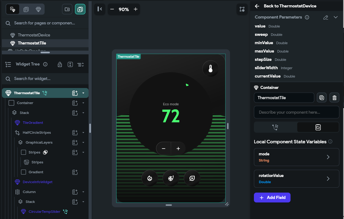
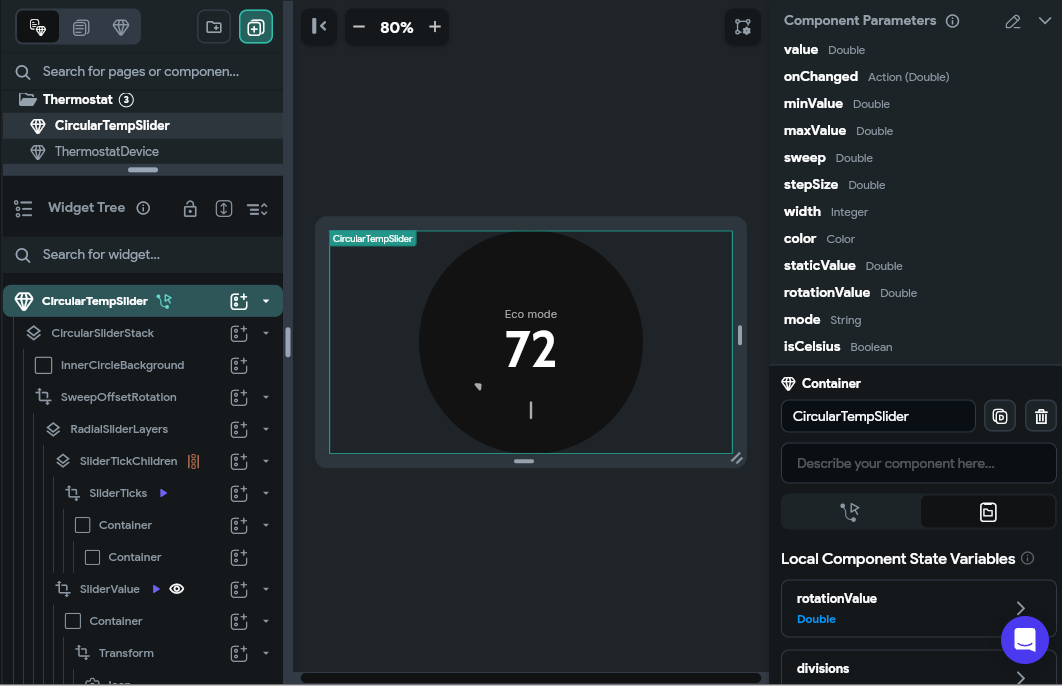
All the little notches are created using dynamic children and custom rotations and the temperature indicators are also rotated into place dynamically. There are also various animations when switching between modes. We were pretty impressed with what our design team was able to do here!
Functionally, it is really just a delta-based Slider under the hood, but we recommend checking it out if you’d like to see an advanced layout example in FlutterFlow.
We hope you found a little of this useful! Again, if you’d like to test these out yourself, please do check out the Smart Home Hub project on FlutterFlow Marketplace. As always, if you have any questions about the techniques above, let us know in the comments below.
test
挺不错的样子嘛!
I really like reading through a post that can make men and women think. Also, thank you for allowing me to comment!