Handling layout changes across a broad landscape of devices and browsers typically involves the use of media queries, which enable layouts to bend and flex based on their viewing environment.
Most queries I see are built around the concept of width:
@media screen and (max-width: 640px) {
    body { background-color: blue; }
}
I love the simplicity of this methodology. It’s straightforward, easy to implement, and it works with content that comprises most websites. But what about web-based apps, the website’s younger cousin? Is this model the most effective media query strategy that can help us with the unique challenges of designing web applications?
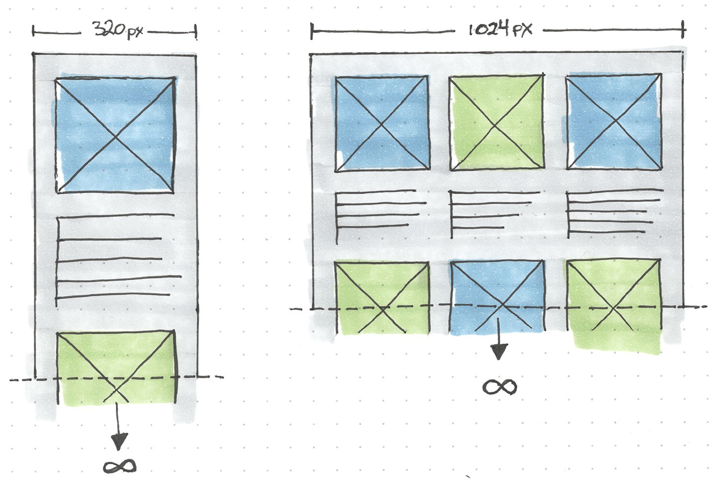
Blocks of content flow under each other.
The rate at which browsers and the internet evolve, means the web is becoming an increasingly viable platform for companies that need their services and tools to work everywhere, regardless of operating system or device. We need to consider how we approach our thinking towards designing effective experiences from viewport to viewport, and make considerations for how we approach designing device-agnostic applications.
A Different Set of Needs
Web apps often demand a greater level of interaction, persistent tooling, and feedback/response systems that react to user input. Consider how a person interacts with their phone. How do they hold their device in portrait compared to landscape? The controls that work well in one orientation may not be nearly as useful in the other. What about a tablet?
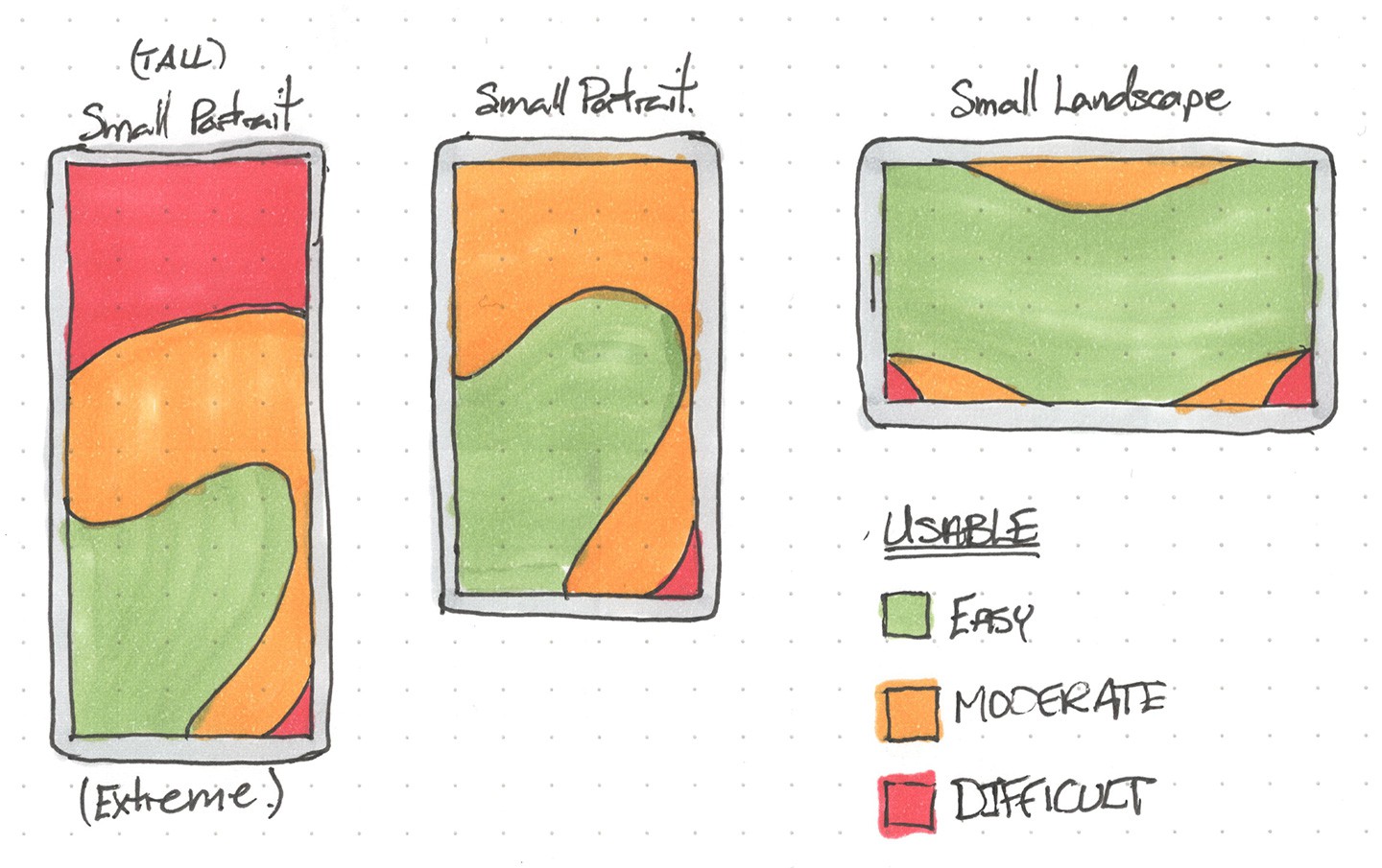
Some areas are easier to interact with.
The size and weight of a larger device may make a huge difference in how you design the interactions based on what a person is physically capable of, given their context. Knowing the shape and size of the canvas as well as the type of interaction that is possible is critical to how I make decisions around crafting great experiences for the web.
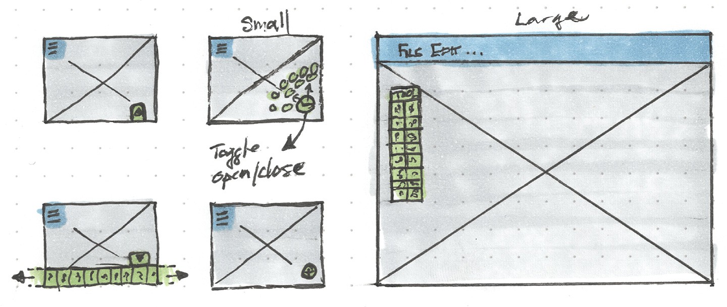
A different scale may require different interaction patterns.
How can media queries help inform us and influence our thinking and problem solving more effectively than the typical “width” model? I think a good idea is to think of a system that tells us enough about the size and shape of the canvas we are working with, an approach that helps us visualize and communicate relationships in more meaningful way. This requires a model that designers, developers, and customers can easily recognize, visualize, and discuss together.
My Mental Model
I think of, and communicate, layouts in terms of size and shape. I often give and receive feedback like “This [insert tool or feature] is hard to use on my [insert device] when I’m in [insert orientation]”. These are the conversations I have with team members and clients alike, and I want a system that maps more effectively around this discussion. One thing I’ve noticed about these conversations, is that they all relate to the size and shape of the viewport. From tall and narrow screens, to short and wide screens, and from tiny phones all the way up to huge 4k displays, these discussions about where and when layouts and design patterns need adjusting can be as varied as there are devices to test on.
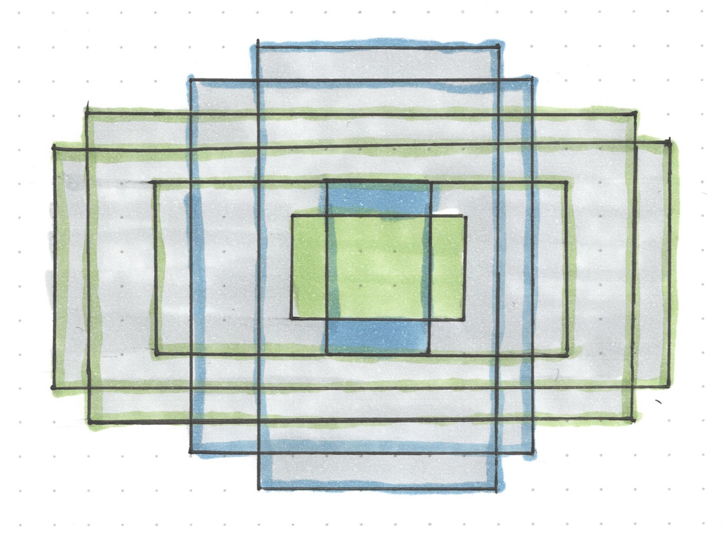
The modern web has a lot of shapes and sizes.
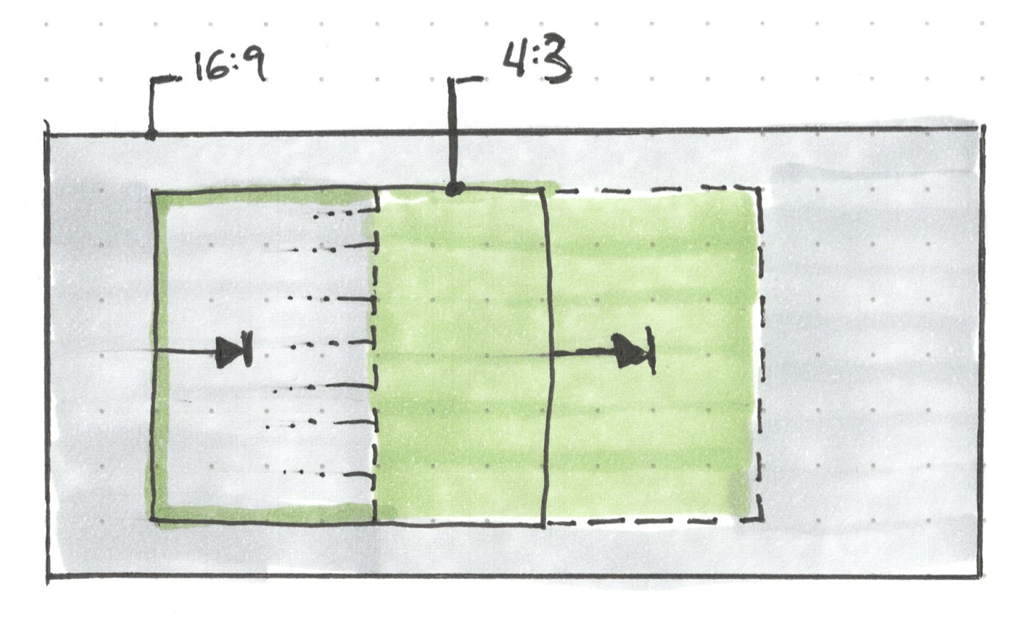
Take a look at a few of the devices listed on screensiz.es and you’ll quickly notice that there are many aspect ratios and physical/pixel sizes used for screens. There are a lot of potential shapes and sizes to consider, but you’ll also notice that there are some patterns that emerge. For instance, there are phones, tablets, and desktops that all share an aspect ratio of 16:9 while others use 4:3 or 5:8. Desktops are a little different because they can take on whatever shape a person wants to bend their browser to.
Limiting your frame of reference to ‘width’, makes it difficult to communicate issues with user experience across a variety of form factors.
Looking for Reference Points
I look at other industries that share a similar model to see how they approach composition and art direction to get the most effective results. Consider film and TV where directors and cinematographers plan shots that would work equally well in a variety of contexts. Some of the more common video standards include 2.39:1, 16:9, 4:3, 1.85:1. Their shots need to work in all of these environments. Pan and scan was a common work-around for film makers that allowed them to adapt to the various formats.
Pan and scan attempts to maintain the best composition possible.
Photography also gives us a good parallel. I recently printed some of my photographs and again encountered a similar model that needs to account for a variety of potential environments. I had options for printing on a wide variety of shapes ranging from small 5”x7” rectangles, perfectly square 5”x5”, and all the way to an extreme 12”x36” panoramic. Obviously not every shape or size will work with how I captured my photo. In some cases I may need to close crop a photo and show only a detail of the larger image, but in others I may need to show as much of the image as possible.
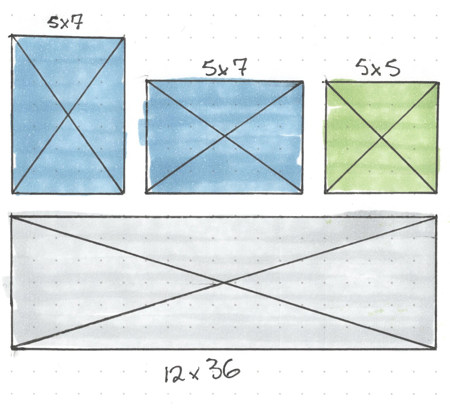
A few of the options for printing pictures.
I think of the same constraints when considering layouts for the modern web. I need information about all the potential outputs in order to plan and create an effective design. Am I on a small, medium, or large canvas? What is the shape of the canvas? Having a clear mental model of the canvas I’m working with helps me predict and make more informed design decisions that are tailored to the right context.
Mapping this Model to Media Queries
So what media query approach can we take that gives us the benefit of a clear mental model that incorporates shape and size?
Shape == Aspect-Ratio
Size == Width (our old friend)
Combining these two parameters gives us any rectangular viewport. By working with a mobile/portrait first approach we can create highly predictive queries that help us visualize, plan, and communicate breakpoints in a way that may be more human-friendly and enable more predictive progressive enhancements than widths alone will allow.
If we take a lesson from photography we can see a general grouping of shapes that have been established (portrait, square, landscape) where changes in composition could be considered. And for sizes, we have phone, tablet, and desktop (small, medium, large)
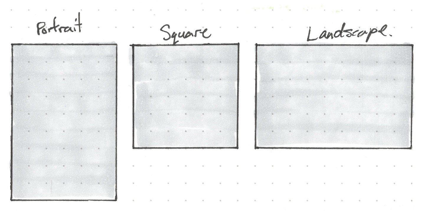
Different shapes may require variations in layout and composition.
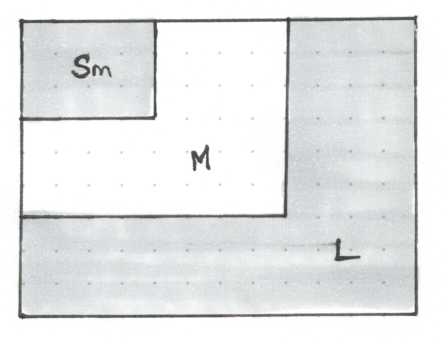
Different sizes may require variations in layout and composition.
A Sassy Implementation
What could an implementation of this idea look like using a pre-processor like Sass? I’d like to set a series of query breakpoints in a settings file and then just reference them with a quick mixin that would take care of handling the media query output, keeping in mind a mobile/portrait layout (min-aspect-ratio goes from portrait to landscape).
// Query Breakpoints
$small: 640px;
$medium: 1024px;
$large: 1600px;
$square_s: "3/4", $small;
$square_m: "3/4", $medium;
$square_l: "3/4", $large;
$landscape_s: "4/3", $small;
$landscape_m: "4/3", $medium;
$landscape_l: "4/3", $large;

// Example Element
.myDiv {
    background-image: url("portrait-s.jpg");
    background-size: cover;

    // Breakpoints
    @include bp($medium...){
        background-image: url("portrait-m.jpg");
    }
    @include bp($large...){
        background-image: url("portrait-l.jpg");
    }
    @include bp($square_s...){
        background-image: url("square-s.jpg");
    }
    @include bp($square_m...){
        background-image: url("square-m.jpg");
    }
    @include bp($square_l...){
        background-image: url("square-l.jpg");
    }
    @include bp($landscape_s...){
        background-image: url("landscape-s.jpg");
    }
    @include bp($landscape_m...){
        background-image: url("landscape-m.jpg");
    }
    @include bp($landscape_l...){
        background-image: url("landscape-l.jpg");
    }
}
Does it Work?
I’m not sure yet. If it is easy to work with and it helps us create more effective solutions with greater ease and predictability, I may work it into more experiments and projects. It could become the foundation of our approach to media query breakpoints or it may get put back into the idea stack. I do like this concept and I think it is worth further experimentation.
If you’d like to play with the idea, I built a scss mixin that you can fork on GitHub.
I’d love to hear about your thoughts on this model, or experiences and approaches with alternative media query strategies for creating responsive or adaptive web apps, sites, or experiences.
Update – June 2, 2015
Similar concepts include Adaptive UI Breakpoints for Material Design