Using the SCSS Baseline Type Utility
Typographers and type enthusiasts will attest that aligning a typeface to its baseline grid is an essential part of any text-heavy design. Maintaining a consistent vertical rhythm is an important part in the creation of beautiful typography and layouts. This is accomplished easily in programs such as Adobe InDesign. However until now, I have yet to find a tool that easily accomplishes this with web type, while remaining flexible to the individual needs of a project.
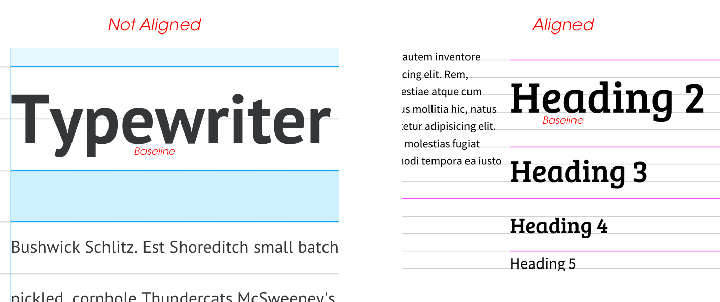
The line-height CSS property is used to set the vertical spacing between lines of text, but unfortunately pays no attention to the visual baseline of a font. This can lead to awkward vertical rhythm, reducing the overall readability of the body of text. Utilities such as Gridlover and baseline attempt to solve this problem, but they fall short in visible alignment and customizability respectively.
Download the Baseline SCSS Utility from GitHub
There are plenty of tools available across the internet for aligning web type to a grid, but I have not come across any that maximize automation, flexibility, and accuracy using only Sass. Smashing Magazine’s article does a good job of summarizing the problem and displays the difficulties in solving it manually without a utility such as this.
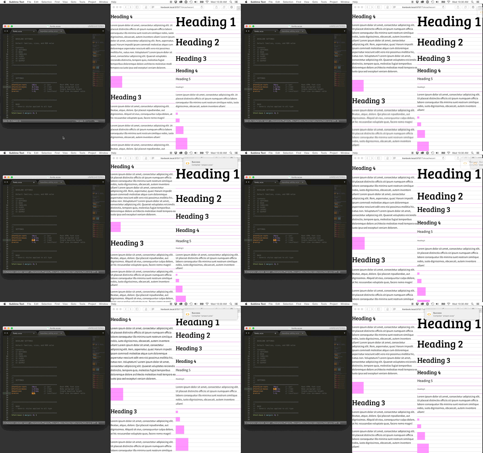
The SCSS-Baseline-Type-Utility allows the Sass-savvy designer to quickly create beautiful type hierarchy by just adjusting a few settings. Completely JavaScript free, all the needed information is preprocessed in the Sass compiler and accessed via CSS.
How it Works
Pick your settings
- Body size
- Unit height
- Scale ratio
These are the main settings to set up your grid. They can be adjusted at any time.
//*******************************************
//
// SETTINGS
//
//*******************************************
$fontSize-root:   10px;     // (px) Root HTML font size - 10px default
$fontSize-base:   1.5rem;   // (rem) Body paragraph size
$baseline:        2.3rem;   // (rem) Single baseline height
$ratio:           1.4;      // (unitless) Font size increment ratio
Pick your font families and styles.
In order to align type to its visible baseline, the baseline position needs to be known to the utility. Use the demo files to find the “Shift Ratio” value for your selected fonts. This is essentially stating how far down the font the baseline is from its vertical center. This point can vary between fonts and requires a small amount of trial and error to find the correct value. The font face will not align to its baseline grid without this value determined accurately.
//*******************************************
//
// BASE
// - Generic styles applied to all type
//
//*******************************************
%font-base { margin: 0; }

//*******************************************
//
// FAMILIES
// - Font families, weights, and styles
//
// SHIFT RATIO
// - (unitless)
// - Different for each fon
// - This value describes the location of the font's baseline as a percentage
// - Using an accurate value for each font is essential to proper alignment
//
//*******************************************
$fontFamily-primary: 'Bree Serif', serif;
$shiftRatio-primary: 0.37;
%fontFamily-primary {
    @extend %font-base;
    font-family: $fontFamily-primary;
    font-style:  normal;
    font-weight: normal;
}

$fontFamily-secondary: 'Source Sans Pro', sans-serif;
$shiftRatio-secondary: 0.32;
%fontFamily-secondary {
    @extend %font-base;
    font-family: $fontFamily-secondary;
    font-style:  normal;
    font-weight: normal;
}
Pick your size increments.
These values specify which ratio increments you plan on using. This way, you aren’t required to use consecutive intervals in the ratio. Layout settings can be applied to sizing and spacing properties throughout the project to keep containers aligned with the baseline grid as well.
//*******************************************
//
// SIZES
// - Font size ramp ratio increments
// - Should be unitless
//
//*******************************************
$fontSize-smallest: -1;
$fontSize-smaller:   0;
$fontSize-small:     1;
$fontSize-default:   2;
$fontSize-large:     3;
$fontSize-larger:    4;
$fontSize-largest:   5;

//*******************************************
//
// LAYOUT
// - Layout size ramp baseline increments
// - Should be unitless and used with the baseline-grid function
//
//*******************************************
$gridUnit-smallest: baselineGrid(0.5);
$gridUnit-smaller:  baselineGrid(1);
$gridUnit-small:    baselineGrid(2);
$gridUnit-default:  baselineGrid(3);
$gridUnit-large:    baselineGrid(4);
$gridUnit-larger:   baselineGrid(6);
$gridUnit-largest:  baselineGrid(8);
Create the output.
Create your selectors, extend your font families, and select your font-size settings and shift ratio variables. These settings can be extended throughout the project, ensuring consistency and the ability to update preferences easily. Vertical spacing can be fine-tuned by adding or subtracting the $baseline using the top or bottom margin.
h6,
.font-smallest,
%font-smallest {
    @extend %fontFamily-secondary;
    @include baselineFont( $fontSize-smallest, $shiftRatio-secondary );
}
p,
.font-smaller,
%font-smaller {
    @extend %fontFamily-secondary;
    @include baselineFont( $fontSize-smaller, $shiftRatio-secondary );
}
h5,
.font-small,
%font-small {
    @extend %fontFamily-secondary;
    @include baselineFont( $fontSize-small, $shiftRatio-secondary );
}
/* ... */
Get Results
What you get is easily accessible presets to use throughout the project. They include font-family choices with automatically-calculated sizes and spacing that adhere to a custom ratio and baseline grid. The implementation is reductive and highly customizable to suit the needs of any project.

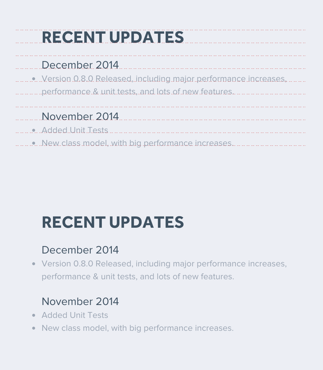
The baseline utility, as used on the next CreateJS.com update.
If you found this tool useful or interesting I would be happy to hear from you in the comments or via @gskinner_team on twitter.


Thanks!