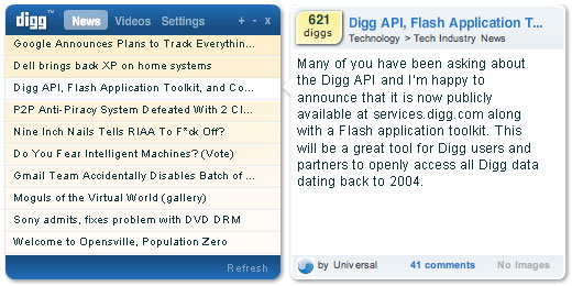
When we were invited to build a sample application for the Digg API contest, my first thought was to do something cool with another new release. We’ve been doing a ton of work with Apollo (our “gTimer” time management app for example), and I decided it would be fun to do something more “creative” with it.
The concept was to build a desktop Digg reader that I would personally want to use (I’m fussy). I wanted it to be something really functional and useful. I wanted an Apollo application that added value to the Digg experience, and skipped the seemingly obligatory cube flip effect (fast becoming the hallmark of Apollo apps). This wasn’t planned to be an application that wowed you at first sight, but rather be an application you’d want to keep using after the first day or two.
The end result was DiggTop. It’s a nice, small (<500kb), unobtrusive (especially in mini mode), cross-platform application (Mac OSX and Windows XP) that lets you view a custom blended Digg feed on your desktop. We mainly aimed to keep it simple and usable, but we also threw in a few cool features, like keyword feed support, custom article notifications, video preview, application update notification, and image slideshows. I'd love to go into depth about it's features and how we built it, but I'm catching a plane to FitC Toronto in the morning, and should probably finish packing. Instead, I'll leave you with a screenshot, and a link to the DiggTop home page, where you can learn more, and download the alpha application for free.
Check out Kevin Rose’s blog entry for information on the API, and the contest (which is sponsored in part by adobe).


It’s a pity that, like most online contests, it’s open only to folk who are “legal resident of the United States”
That is a really neat use of multiple applications. Not a huge digg fan, but overall this app is very nicely designed and super functional.
Andrew:: Yeah, f_ck that p_sses me off! It’s the “World Wide Web” until of course, you leave American shores. I dig Digg – but I’d dig that contest down if my vote mattered a damn.
NEAT! I do like the size and relationship of the windows. But it screams for a the ability to view video larger. Two co-works walked by and saw it – that was their first comment as well.
Apallo is looking good!
You should add an ‘always on top’ option, if that is possible with Apollo, so that it would always appear on top of other windows. In mini-mode, this would be very useful, having it float above the task bar of maximized applications, for constant distraction from work 🙂
On my Mac, links in DiggTop try to open in TextMate.
Not sure where it got the idea to do that.
Pretty cool. I wish there was a way to hide the right pane though.
Is there going to be a way to resize Apollo windows?
– Always on top isn’t supported yet in Apollo.
– Resizing the videos / photos is one of the many future features we want to implement. 🙂
– Currently Apollo windows do re-size by default, in this case we chose to remove the re-sizing.
Wes,
Digg crowds up my RSS reader. I hate that.
DiggTopp could fix this. I like everything about it.
…except how it tries to use TextMate to open links.
Any advice?
Edward: Apollo just opens its links in the systems default browser. I’m on a mac as well and all my links open in Firefox. So maybe just confirm that your default browser is FF or Safari.
Very nice! I’ve been using this for the last couple of days and it’s very good.
I have also just created a site using the Digg API, more useful at the moment for story submitters. I plan to expand it soon.
http://www.duggornot.com
Looking at some other sites I’m a bit worried now that I used ‘dugg’ in my URL. Oh well, we’ll have to see what happens.
Looks like my worries were well founded. I just had received an email from the Digg lawyers – I have to change my domain name 🙁