One of the great things about Flutter, is how you can use composition to combine multiple built-in Widgets, creating unique UI’s very quickly and easily.
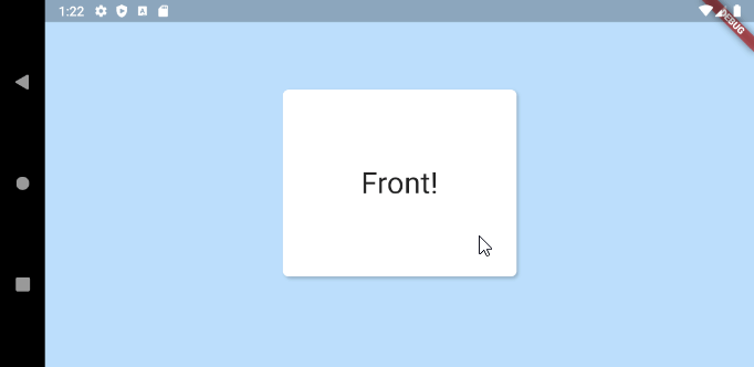
Today, we’re going to create a FlippableBox, which is a double-sided card, that holds two pieces of content and automatically re-sizes to match its content, whenever it’s flipped over.
It will end up looking something like this:
Step 1: Get Flipped
In order to get the card flip effect, we need to rotate the Box on its vertical axis (rotationY).
This is easy using the Transform() widget. We’ll create a simple wrapper widget for this specific purpose:
class RotationY extends StatelessWidget {
  //Degrees to rads constant
  static const double degrees2Radians = pi / 180;

  final Widget child;
  final double rotationY;

  const RotationY({Key key, @required this.child, this.rotationY = 0}) : super(key: key);

  @override
  Widget build(BuildContext context) {
    return Transform(
        alignment: FractionalOffset.center,
        transform: Matrix4.identity()
          ..setEntry(3, 2, 0.001) //These are magic numbers, just use them :)
          ..rotateY(rotationY * degrees2Radians),
        child: child);
  }
}
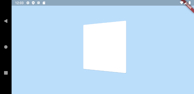
Now we can easily rotate anything, by just wrapping it in RotationY():
RotationY(
    rotationY: 45, //Rotate by 45 degrees on Y axis
    child: Card(child: SizedBox(width: 250, height: 250)));
Which gives us a box, rotated by 45 degrees:
Step 2: Action!
Now that we have rotation working, we need to animate it.
This is very easy in Flutter. We can just wrap our RotationY() in a TweenAnimationBuilder()!
TweenAnimationBuilder() is an extremely versatile widget that allows you to easily animate a wide variety of types. You define a Tween of a certain type (double, offset, shape, etc.), and any time you change the end value, the value within the builder will animate from its current value to the end. It also accepts duration and curve values for additional control.
Here we’ll animate a simple double value, from 0 to 180, like so:
Widget build(BuildContext context) {
  return TweenAnimationBuilder(
    duration: Duration(milliseconds: 700),
    curve: Curves.easeOut,
    tween: Tween<double>(begin: 0, end: isFlipped ? 180 : 0),
    builder: (context, value, child) {
      return RotationY(
        rotationY: value,
        child: Card(),
      );
    },
  );
}
Now, when isFlipped = true, the rotationY value will transition to 180 degrees, and when false, it will transition back to 0 degrees.
That gets us something like this:
It’s that easy! As mentioned earlier, you are not limited to animating numbers. With TweenAnimationBuilder you can can animate many other datatypes, including Offset, Shape, Color and a bunch more. For a full list check out the implementers section of the Tween docs.
Step 3: Add content
Now that we have an animating, flipping box, we need to actually supply it with some content.
Here we can see our final Widget begin to take shape. We’ll accept two child Widgets, front and back, and we’ll switch which one is shown, based on our rotation. From 0-89 degrees we’ll show the front, from 90 – 180, we’ll show the back:
class FlippableBox extends StatelessWidget {
  final Widget front;
  final Widget back;
  final bool isFlipped;

  const FlippableBox({Key key, this.isFlipped = false, this.front, this.back}) : super(key: key);

  @override
  Widget build(BuildContext context) {
    return TweenAnimationBuilder(
      duration: Duration(milliseconds: 700),
      curve: Curves.easeOut,
      tween: Tween(begin: 0.0, end: isFlipped ? 180.0 : 0.0),
      builder: (context, value, child) {
        var content = value >= 90? back : front;
        return RotationY(
          rotationY: value,
          child: content,
        );
      },
    );
  }
}
That gets us something like this:

The motion is nice, but the problem is obvious: our back content is flipped horizontally 🙁
This is easily solved, by just adding another RotationY widget, this one will not animate, it will just flip the content 180 degrees when we’re showing the back.
return RotationY(
  rotationY: value,
  child: RotationY(
      rotationY: value >= 90? 180 : 0,
      child: content),
);
With that slight tweak, we’re in business!
Step 4: Let’s get flexible
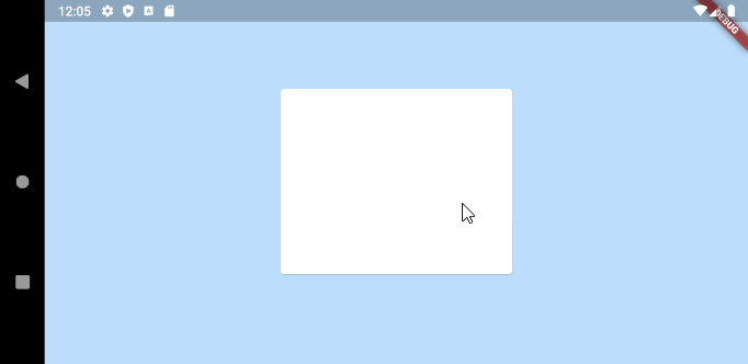
What we have is great if our front and back Widgets are always the same size, but what if they aren’t?
We could just allow the Widget to resize instantly, which looks … ok?

But we can do better than that! Wouldn’t it be nice if the card could animate to the size of its content? Again, this is pretty easy to do, just using some built-in Flutter Widgets and some light composition.
To make this happen we’ll use a built-in Flutter Widget called AnimatedContainer. This is probably the biggest and most gnarly of all the Implicitly Animated Widgets, but it’s also one of the most powerful. With it, you can animate virtually all properties of Container. That includes size, which is exactly what we need!
To keep things clean, we’ll again create our own little Widget, that just wraps AnimatedContainer, adding a touch of code to grow or shrink according to the size of its child.
class AnimatedBackground extends StatelessWidget {

  final Container child;
  const AnimatedBackground({Key key, this.child}) : super(key: key);
  @override
  Widget build(BuildContext context) {
    return AnimatedContainer(
        width: child.constraints.maxWidth,
        height: child.constraints.maxHeight,
        duration: Duration(milliseconds: 700),
        curve: Curves.easeOut,
        child: child);
  }
}
You can see that we require the child is a Container, and it must have valid constraints set on it. This is necessary because AnimatedContainer needs to know the target width and height that it’s animating to.
With that Widget created, it’s simple to add it to our FlippableBox:
class FlippableBox extends StatelessWidget {
  final Container front;
  final Container back;

  final bool isFlipped;

  const FlippableBox({Key key, this.isFlipped = false, this.front, this.back, this.bgDecoration}) : super(key: key);

  @override
  Widget build(BuildContext context) {

    return TweenAnimationBuilder(
      duration: Duration(milliseconds: 700),
      curve: Curves.easeOut,
      tween: Tween(begin: 0.0, end: isFlipped ? 180.0 : 0.0),
      builder: (context, value, child) {
        var content = value >= 90? back : front;
        return RotationY(
          rotationY: value,
          child: RotationY(
              rotationY: value > 90? 180 : 0,
              child: AnimatedBackground(child: content)),
        );
      },
    );
  }
}
With that addition, we now have smooth, animated transitions as the card flips over:
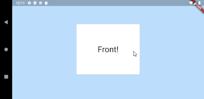
To finish up, here is the actual usage example above:
  GestureDetector(
    onTap: () => setState(() => _isFlipped = !_isFlipped),
    child: FlippableBox(
      front: _buildCard("Front!", 250, 200),
      back: _buildCard("Back...", 350, 350),
      isFlipped: _isFlipped,
    ),
  ),
...
Widget _buildCard(String label, double width, double height) {
    return Container(
      width: width,
      height: height,
      child: Center(
        child: Text(label, style: TextStyle(fontSize: 32)),
      ),
    );
  }
There’s more we could add here, like animated background colors, corner masking, and adjustable parameters, but that’s probably enough for one post!
To view the full source code, or to include in your project as a package, check out the plugin on pubdev: https://pub.dev/packages/flippable_box
We hope you enjoyed learning about some new Flutter features, and please check back often to our blog for new Flutter-related content.
Thanks a lot