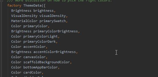
There is a lot to like about Flutter, but one area I’m sure no one loves, is taming the Material Theme system! With over 65(!) properties, some of which, like TextTheme, break out into 10 more sub-properties is enough to make you go crazy pretty quick.
Last week we looked at how you can easily implement TextStyling, and this week we’re going to dive into Color Themes. We’ll take a look at a technique that we use to implement custom app-specific themes, while still providing Material ThemeData to the core Flutter components.
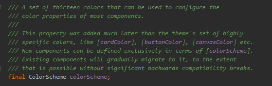
ColorScheme… helps. A bit.
To presumably help ease this pain, the Flutter team has introduced the ColorScheme class which condenses the above properties, into 13 colors.
While ColorScheme is a nice distillation of the elements of a Material Design Theme, what if you want to implement your own custom theme? Maybe you want two background colors, instead of Material’s one, or three accents, instead of two, ColorScheme alone will not really help you achieve this.
We can’t simply create our own custom theme, as so many of the core components of Flutter are Material based. We would be fighting the framework the entire time, forced to inject colors all over the place, and inevitably running up against hard-coded defaults we could not reach.
Make it work!
To meet this requirement, we use a fairly simple architecture:
- Create a customized AppTheme class, with the specific properties you need for your theme.
- Add an appTheme.themeData function, that will generate ThemeData (using ColorScheme as a helper!)
- Use Provider to pass our AppTheme to the rest of the app, and at the same time, inject appTheme.themeData as the main MaterialApp theme.
Makes sense? Kinda? This will probably be easier to explain with code 🙂
First lets take a look at a simplified version of a custom theme. For the sake of example, let’s say our theme has only 1 bg, and 1 accent, and everything else is generated from that. Let’s call it the MS-DOS theme 😉
class MyAppTheme {
  Color bg1;
  Color accent1;
  bool isDark;

  /// Default constructor
  MyAppTheme({@required this.isDark});

  ThemeData get themeData {
    /// Create a TextTheme and ColorScheme, that we can use to generate ThemeData
    TextTheme txtTheme = (isDark ? ThemeData.dark() : ThemeData.light()).textTheme;
    Color txtColor = txtTheme.bodyText1.color;
    ColorScheme colorScheme = ColorScheme(
        // Decide how you want to apply your own custom them, to the MaterialApp
        brightness: isDark ? Brightness.dark : Brightness.light,
        primary: accent1,
        primaryVariant: accent1,
        secondary: accent1,
        secondaryVariant: accent1,
        background: bg1,
        surface: bg1,
        onBackground: txtColor,
        onSurface: txtColor,
        onError: Colors.white,
        onPrimary: Colors.white,
        onSecondary: Colors.white,
        error: Colors.red.shade400);

    /// Now that we have ColorScheme and TextTheme, we can create the ThemeData
    var t = ThemeData.from(textTheme: txtTheme, colorScheme: colorScheme)
        // We can also add on some extra properties that ColorScheme seems to miss
        .copyWith(buttonColor: accent1, cursorColor: accent1, highlightColor: accent1, toggleableActiveColor: accent1);

    /// Return the themeData which MaterialApp can now use
    return t;
  }
}
This might look like a lot of code, but there’s not much going on. Let’s take a look:
- Lines 11-12: Because Material uses a ton of TextStyles, we use the ThemeData.dark() and ThemeData.light() constructors as a shortcut to get some default TextThemes for light or dark mode.
- Line 13-27: We create a ColorScheme based on our own custom theme properties.
- Line 30: Call ThemeData.from(textTheme, colorScheme) which gives us back a ThemeData.
- Line 32: Finally, we can set any additional ThemeData properties that ColorScheme misses.
With that in place, we can simply create our two-color theme, and pass it down to the app:
class ThemeSpike extends StatelessWidget {
  @override
  Widget build(BuildContext context) {
    // Create custom app theme, just 2 colors
    MyAppTheme appTheme = MyAppTheme(isDark: true)
      ..accent1 = Colors.grey
      ..bg1 = Colors.black;
    // Provide appTheme to the entire sub-tree
    return Provider.value(
        value: appTheme,
        child: MaterialApp(
          // Inject themeData into the MaterialApp
          theme: appTheme.themeData,
          home: HomePage(),
        ));
  }
}
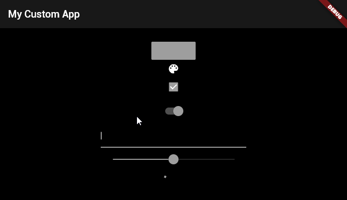
And with that, we get this beautiful app!
Simplified code for that view would look like this:
class HomePage extends StatelessWidget {
  @override
  Widget build(BuildContext context) {
    // Use provider to grab the current theme
    MyAppTheme theme = Provider.of(context);
    // Material components like AppBar & Scaffold are styled by default
    return Scaffold(
        appBar: AppBar(title: Text("My Themed app!")),
        body: Center(
          child: MaterialButton(
            // Use own custom theme colors as needed
            color: theme.accent1,
          ),
        ));
  }
}
You can see that we don’t have to explicitly provide Text, AppBar or Scaffold colors, that’s all being handled by the MaterialApp.theme. At the same time, if we need to access our custom theme values, they are readily available using Provider.
Note: Provider is not required for this technique. You could use InheritedWidget, a static ValueNotifier or any number of ways to pass your Theme around.
This is an oversimplified example with quite an ugly theme, but we hope this gives you some fresh ideas on how you can implement styling in your own apps. The next step would be to create multiple themes, and some sort of ThemeType system, so you can saving/load them at startup!
Also, it’s worth noting that the Flutter team are actively working on improving the current system. If you’re interested, you can view the history of this issue, and and comment on the latest proposals here: https://docs.google.com/document/d/1kzIOQN4QYfVsc5lMZgy_A-FWGXBAJBMySGqZqsJytcE/edit#
Thanks for stopping by 🙂
Need help building something cool in Flutter? We’d love to chat.
Love it !
I’m just wondering how on your last piece of code you can call Provider.of(context) without giving a generic type ?
Type inference is at work here. Since we’re defining the type explicitly, there’s no need to pass it a second time to the provider generic.
Actually, in our real production code, we’re using the new provider extension methods(watch,read,select), so it becomes as simple as:
AppTheme theme = context.watch();My extra tip is to add of(BuildContext method) to the custom theme. This way we can call `MyTheme.of(context).bgColor`.
Nice work.
As a little enhancement, brightness could be automatically detected from background color using ThemeData.estimateBrightnessForColor(color)
Some good comments here to follow up a great read. Thanks!
Great article … But joining the great article with a state management at the end ?! Does not boil well on someone new