Earlier this year Google and Ubuntu approached us with an open brief, to try and create a full-scale desktop application for Linux, macOS, Web, and Windows. The result was Flokk, which we released (and open-sourced) back in July.
In this post, we’re going to dive into some of the challenges we faced, the discoveries we made, and desktop-specific features that we added.
Warning…
This post is long! You may need multiple rounds to make it through 😀 To help break it down, here are the major sections:
- App Scaffold
- App Extensions
- Architecture and State Management
- Performance
- Styling
- Desktop Specific Features
- What’s Next
What’s Flokk?
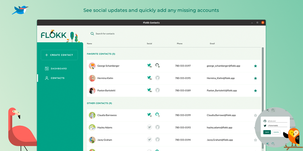
Flokk is a “Social Contacts Manager”; it syncs with your Google account, imports all your Contacts and allows you to manage them. Additionally, you can link Twitter and Github accounts for each contact, and see all of their social activities at a glance.
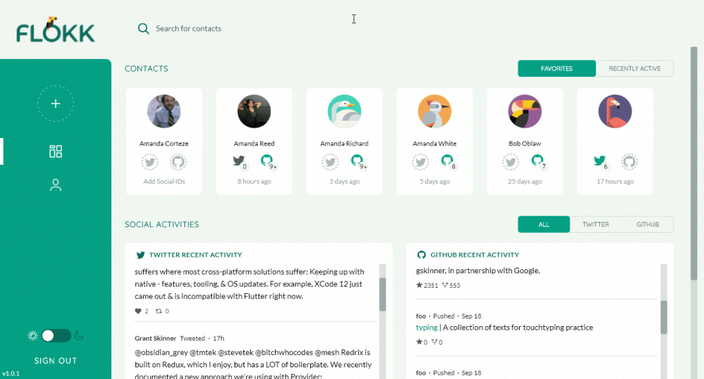
More than anything though, Flokk is a proof of concept — aimed at pushing Flutter for Desktop forward, and proving that Flutter is capable of building a really excellent desktop-class app.
Before going any further, if you’d like to install it yourself, download it from the releases page!
App Scaffold
One of the first things we needed to figure out was a desktop-style responsive app scaffold. What we needed was much closer to something like Slack or Chrome, not your typical Material App which is generally focused on full-page routes.

To implement this we kept it simple and used basic Flutter Widgets like Stack, Padding, and Positioned. We do a bit of layout logic in the view, to decide what size we want the various panels, and then we animate padding and offset values to slide things in and out.
You can check out the final Scaffold here, and admittedly it is pretty complex at first glance, but under the hood most of it is built off a simple AnimatedPanel widget. AnimatedPanel just slides itself in and out of the Viewport, based on a double closeX and a bool isClosed. We also wrote an extension for it, so we can do things like this:
// This panel will animate itself off the stage when isClosed=true
MainSideMenu().animatedPanelX(closeX: -leftMenuWidth,isClosed: !showLeftMenu)
The main content area itself, is just a positioned stack with some variable padding, which we animate whenever it changes. In a simplified form, this is what is going on:
Stack(children: <Widget>[
    /// Main Content Area
    contentStack.padding(top: topBarHeight + topBarPadding),

    /// ... various AnimatedPanels surround the content area
  ]
)
.positioned(left: leftContentOffset, right: contentRightPos, bottom: 0, top: 0, animate: true).animate(animDuration, Curves.easeOut),
If the above .positioned or .animate syntax looks a little foreign, it’s because we made use of the https://pub.dev/packages/styled_widget package. We like to use this because it allows us to expose our leaf nodes first, with formatting following the content. In this case, we can use it to easily animate the left and right values of a Position stack, without having to manage an AnimationController or nest inside a TweenAnimationBuilder.

App Extensions
Speaking of extensions, we used quite a few to help us write easier to read and more succinct code. We also gathered them together in one file, so we can use a single include throughout the app.
In no particular order, they are:
- sized_context – Allows you to fetch
MediaQueryinfo directly off theBuildContext, making responsive code cleaner. - styled_widget – Provides a ‘swift-style’ UI styling approach which reduces nesting, and puts the leaf-node/content first.
- time – Allows easy creation of
Durationobjects from numbers,duration: .1.seconds. - textstyle_extensions – Allows inline code styling like
style.bold.italic.
You can see almost all of these, nicely at work in this 60-line custom animated tab bar: https://github.com/gskinnerTeam/flokk/blob/master/flokk_src/lib/styled_components/styled_tab_bar.dart
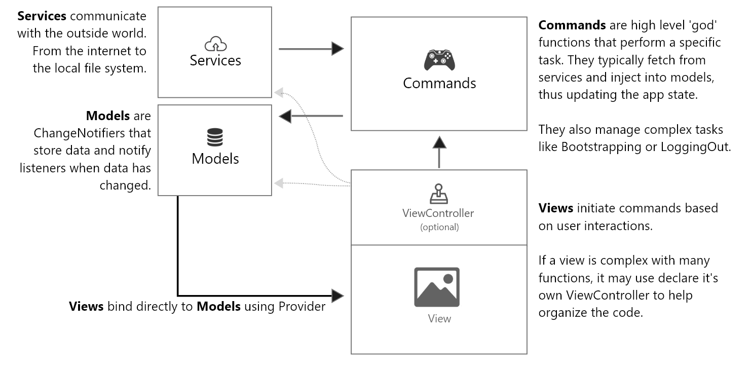
Architecture and State Management
For state management and general architecture, we decided to roll our own MVC-style architecture, using Provider as the backbone for both dependency injection and a uni-directional dataflow (aka view:model binding) and implementing a Command layer on top of that, to handle application logic. We essentially used Provider as a Service Locator that mapped singleton-like models and services to a single top-level context.
We refer to this architecture as MVC+S, and were quite happy with how well it worked. Especially considering how complex this application turned out to be. Since Flokk, we’ve refined this a little further, and have written a State Management using an MVC+S Architecture blog post describing the approach.
As mentioned in the post above, we are planning on open sourcing a production-ready app scaffold based on this architecture sometime soon.
App Performance
A major area of focus was performance optimization and benchmarking. We really wanted to make sure the app ran smoothly on as many devices as possible.
With such a huge variety of devices to support, it became important that we could measure some baseline performance, for both technical and non-technical users. To help with that, we built a performance monitoring widget called StatsFl:

Once we added StatsFL, we quickly noticed an issue: when running on 4K monitors with a non-dedicated GPU (eg. some modern Mac Book Pro’s) we would see large FPS drops when anything at all was animating. We then discovered a Flutter behavior that totally surprised us: animating any widget in your tree will cause a repaint of the entire window! This is subtly mentioned in the Flutter Docs for repaint boundary:
Most Flutter developers know about limiting re-builds, but very few know about limiting re-paints. From our experience on desktop, limiting re-paints is much more important than re-builds. Rebuilds (dart rebuilding the widget layout) are quite cheap and fast on desktop, full re-paints (the CPU pushing pixels to the screen) can be extremely slow. To limit paints in Flutter, you must use the RepaintBoundary widget. From the docs:
This is not a well-known Widget, but it is used quite a bit within the core Flutter code-base. It allows you to define ‘paint regions’ to avoid re-painting the entire screen every time something changes. It’s used in various core Widgets like Hero, TextField, Routes, OverscrollIndicator, CupertinoScrollbar, etc.
For a concrete example, we had these sliding tab bars on the main dashboard. When animating, we saw frame-rates drop considerably on 4k devices. By wrapping them in a repaint boundary, our frame-rate shot back up to 60!

When and where to place these boundaries is tricky to determine, and it would be nice to see more guidelines and talks from the Flutter team on this. In general, it seems to work best to wrap small re-draw regions close to the source, minimizing the size of each paint operation, but the Flutter team also recommends wrapping things like drawers and full-screen overlays. Just be careful not to overdo it, and test often on a variety of devices to see what works best in the real world.
App Styling
One of the primary goals of Flokk was to making something really beautiful. We wanted to push design beyond Material or Cupertino, and make something custom with more desktop-focused feel. This pushed us to evolve our styling and design systems in several ways.
Design Grid
In order to ensure we were matching the highly dynamic comps from our design team, we implemented a classic “design grid” from Sketch, as a widget we called DesignGridOverlay.

Style Iteration
With the high-fidelity and precision of our comps, we needed to enable quick iteration and easy maintenance so we implemented a ‘design system’ which consists of several classes, which hold static styling methods, referenced throughout the app.
For example, all paddings/spacings throughout the app pull their values from the EdgeInsets class:
class Insets {
  static double scale = 1;
  static double get xs => 2 * scale;
  static double get sm => 6 * scale;
  static double get m => 12 * scale;
  // etc
}

//Usage
bool isLargeDevices = context.widthPx > PageBreaks.TabletPortrait;
return MyWidget(padding: isLargeDevices? Insets.m : Insets.sm);
The nice thing about this approach of Static Accessors, is that it fully supports hot reload. We can change any of the values of the styling system at runtime, and see the app update instantly. Admittedly, this is not the most performant approach and when your design has solidified, it would be a good idea to revert these to simple variables or constants.
App Theming
A final styling hurdle we ran into was that the design system coming from our design team did not line up perfectly with the available fields of the Material theme. This led us to create our own dedicated AppTheme class, which can turn itself into a ThemeData object, for use with existing Material widgets, but also contains some additional design tokens that were required for our app.
For more on this approach, check out our blog post on How to Create Custom App Themes. The basic idea is that you create an AppTheme wrapper around Material’s ThemeData, using whatever design tokens you need. Then your AppTheme has a toThemeData method, which you provide to the MaterialApp. That takes care of default styling, and then within your own widgets, you look up and use your own AppTheme which is tailored to your specific design comps.
Desktop-Specific Features
Now we’ll jump into some specific widgets and features we had to add for desktop support, specifically:
Scrollbars
Fortunately, this was extremely easy to do. The basic logic is:
- A
Scrollbarwidget and aListViewsit in aStacktogether, sharing aScrollController. - The
Scrollbarwraps itself in aLayoutBuilderso it can get the size of theStack - The
Scrollbarlistens to theScrollControllerand redraws itself whenever scroll position changes, positioning its handle in the correct position with some simple math. - The
Scrollbaralso listens toGestureEventson its handle. When the handle is dragged,Scrollbarupdates the scroll position usingcontroller.jumpTo, again using some basic math to transformdragPxintoscrollPx.

The code looks something like this:
// Calculate the alignment for the handle, this is a value between 0 and 1
// This one line, will keep our handle perfectly in-sync with the ListView
double handleAlignment = maxExtent == 0 ? 0 : widget.controller.offset /
maxExtent;
return Align(
  alignment: Alignment(1, handleAlignment),
  child: GestureDetector(
    onVerticalDragUpdate: _handleVerticalDrag,
    child: DraggableHandle()));
...
// On drag, we use the maxScrollExtent and _viewExtent properties (provided by LayoutBuilder), to determine how much list to scroll, for every px the user scrolled
void _handleHorizontalDrag(DragUpdateDetails details) {
    double pos = widget.controller.offset;
    double pxRatio = (widget.controller.position.maxScrollExtent + _viewExtent) / _viewExtent;
    widget.controller.jumpTo((pos + details.delta.dx * pxRatio).clamp(0.0, widget.controller.position.maxScrollExtent));
  }
To check out the full code, take a look at StyledScrollbar.dart. This is a bit more complex because it’s abstracted to support both Vertical and Horizontal scrolling, and also provides for an optional contentHeight parameter, as we found that controller.maxExtents does not always update correctly. We also have support for some fading animations on the handle, and a background track element.
Mouse Cursors
One of the absolutely key things to a good desktop or web app is the proper handling of mouse cursors. Links need hand cursors, text needs “i-beam” cursors. Otherwise, it just feels wrong!
This came late in our project, but luckily when it did it was extremely easy to use. The direct way to do this, is to use the MouseRegion widget. Using this, you can set any widget, to display any of the SystemMouseCursors types.
MouseRegion(
  cursor: SystemMouseCursors.click,
  child: AnyWidget(),
)
We took this one step further, by defining a clickable extension on Widget, so we could do stuff like this:
return Text("I am a link!").clickable(_handleClick);
In addition to the low-level control with MouseRegion, the Flutter Team has also added support to common controls with MaterialButton.mouseCursor and built-in i-beam cursor support for SelectableText and TextField!
Tab Support
Another key thing with a good desktop application is tab support. To do this in Flutter you use the FocusTraversalGroup widget. You can see in our MainScaffold how we wrapped all the major section of the app in these widgets, this (in theory) allows each section to work as its own tab-tree, but also transition from one region to the next. In practice, this is still a bit hit or miss on desktop platforms. Hopefully, this will get better as the Desktop targets reach maturity.
Occasionally, you will need to manually request focus to some element inside a view, to put you in a good place to begin tabbing. For example, when opening the Edit User panel, we want to be able to set focus directly to that field.

There’s 2 ways you can accomplish this. Either assign autoFocus:true if it’s a TextFormField, or create a FocusNode, assign it to some Focus widget, and then call focusNode.requestFocus()
Focus States
Going along with Tab support are focus states. Tabbing is not much good if you don’t know where you are in the UI!

To do this, we added a FocusNode to our BaseBtn and added a listener so we could track the focused state of each button:
void initState() {
  _focusNode = FocusNode(debugLabel: "", canRequestFocus: true);
  _focusNode.addListener(() {
    setState(() => _isFocused = _focusNode.hasFocus);
}});}
When _isFocused changes, we rebuild, and then just tweak the styling of the Button in the tree:
boxShadow: _isFocused ? [BoxShadow(...)] : [],
foregroundDecoration: _isFocused ? ShapeDecoration(...) : null,
//etc.
One last area that was a bit tricky to style on focus was the TextFormField used throughout the app. Because there was so much styling needed, we created our own StyledTextInput class to apply all the various stylings we wanted.
Dropdown Menus
Dropdowns are a classic desktop UI element, and one that carries very specific expectations for behavior. Specifically, it’s expected that you can Tab into the element, use the down/up arrows to navigate a dropdown, and the enter key to select an item.
This was one of the more complex things to implement in the app, as the requirements were quite lengthy:
- Use the
OverlayAPI to show/hide the dropdown menu - Work with parent scrolling, “following” the parent form field it is attached to if it is scrolled
- Listen to multiple
RawKeyboardevents - Support Tab focus. Because it is in an overlay, and not actually in the tree, a manual focus node must be used.
- Auto-complete from list of items
- Support internal scrolling of the list items
- Support custom typed entries
You can see the code here, and at 220 lines it’s definitely a bit of a beast! Even after all that, the existing version still has a couple of small issues, but in the end it came together pretty nicely!

Complex Forms
Probably the biggest challenge in the app was the contact form. The form for editing a Google Contacts user is immense and very complicated.
Our designers came up with a very neat design which reduced the visual complexity of the contact form significantly, but of course, was quite tricky to implement. The idea is, each item in the form has a generic space-saving placeholder, but when you click into it, it reveals some specific form element. Some of which are multi-line and can also expand, and add new rows. Additionally, they should slide closed, if you do not add any info into the field and have focused out.

To make it more complex, many of the form elements are multi-part, meaning we can’t just close on focus out, but instead need to treat each complex element as one focus item.

This system is too complex to dig into here, but the basic idea was that we created a wrapper widget, called ExpandingMiniFormContainer, we then created a bunch of “mini-forms” for each specific element. The expanding container’s only job was to show some placeholder, and when it received focus, open up, and reveal its inner ‘mini-form’. When its inner form loses focus, it closes back up (unless it has content).
To allow the parent container to know when the internal mini-form has lost focus, we used Notifications. Notifications are another lesser-known API in Flutter, but they are extremely handy for delivering typed payloads from child to parent. Notifications work similarly to Provider but in the opposite direction, they go up the tree instead of down. Rather than delivering something from parent to child in a de-coupled way, Notifications allow the child to deliver something to the parent indirectly.
In our case, each mini-form has a timer, and it watches all its internal fields. Any time a field has focus it resets the timer. If none of its fields are focused for some amount of time, it sends up a FocusChanged Notification, which the ExpandingFormContainer is listening for, and it then closes itself.
This is a bit convoluted to explain, but in practice, it actually worked very cleanly and each form section was quite easy to maintain and built. You can see all the forms laid out in the ContactEditPanel, in a very easy to read layout.
Turning Off Material
One thing we learned is it can actually be pretty tricky in Flutter when you want to totally get away from Material Design!
One of the best tricks we found, was to define a custom NoGlowScrollBehavior , that we could assign to the Material App, which would remove much of the default Ink Splash effect:
    // Disable all Material glow effects with [ NoGlowScrollBehavior ]
    return ScrollConfiguration(
      behavior: NoGlowScrollBehavior(),
      child: navigator,
    );
In addition to this, we had to use a custom scroll behavior for all our lists, which we called StyledScrollPhysics. This simply extends AlwaysScrollableScrollPhysics, which gives us the desktop-style ‘hard’ scrolling we wanted. We could have used AlwaysScrollableScrollPhysics directly, but we wrapped it in our own widget just in case we wanted to modify it app-wide later.
class StyledScrollPhysics extends AlwaysScrollableScrollPhysics {}

//Usage:
return ListView(physics: StyledScrollPhysics())
Finally, we had to deal with Buttons. We did not actually want the InkWell effect that is so deeply baked into the Material widgets. To do this we wrapped RawMaterialButton in our own BaseStyledButton, configuring it to our needs. We then created a bunch of variations like PrimaryBtn, SecondaryBtn etc… It would be nice if Flutter offered a less opinionated button primitive that we could build on, but we’re not aware of one currently.
What’s Next
We’re extremely happy with how the app turned out, and it’s clear to us that Flutter has immense potential as a desktop app platform. Already, in pre-beta states, the applications run beautifully on Windows, Linux and MacOS. We were especially impressed with performance on Linux, with it often being the best performing of the platforms.
Admittedly the current build is still a bit of a work in progress. Our project ran just over 3 months, and we simply ran out of time for a number of wishlist features and optimizations. Also there are a number of usability issues that we’re looking to address soon.
With that said, the existing repo is not under active development. Instead it serves as a large production-scale code base that you can use to pull snippets from, or just to test the latest capabilities of Flutter for Desktop!
You can check out the various versions of Flokk on the releases page:
Or browse the entire code base:
If you have features you’d like to fix or add, please submit a Pull Request and we’ll do our best to get it merged.
Need help building something cool in Flutter? We’d love to chat.
Thanks for sharing this with us. Your blog posts are really very interesting and useful.
I wouldn’t imagine anyone to come up with such great solutions for optimisations, usability and architecture but ex Flash developers! Genius move from Google.
Great resourceful article!
Your repaint boundary link seems not working.
Fabulous project and so much to study and learn from. Great blog about it too. Thanks for sharing this, it is really helpful and useful.
This article is help and quite comprehending, Kudos to you and more strength to your elbow.
Very helpful thanks for sharing
Amazing article, very helpful!
It is/would be possible to embed a Unity3D app into flutter desktop as we did with flutter mobile? eg. by exporting the Unity app as a library?
Hi Shawn,
just saw your post. It’s very similar to my propose RVMS architekture. I don’t know if you have seen my package flutter_command and the get_it_mixin which makes this extremely comfortable.
I gave a talk recently about it at Flutter Warzaw
https://www.youtube.com/watch?v=YZ1NghAH5ro
It’s very important bro , thank you
For others interested in Riverpod version of this project you can find my version at
https://github.com/shaxxx/flutter-mvcs-hello-world
I just switched Provider with Riverpod, with minimal changes.
Advanced example would probably refactor original project and utilize Riverpod much more, but goal was to keep it as close to original as possible.
Informative post thanks for sharing with all of us.